her zen
A mobile-first mental health wellness platform for Asian women that supports their mental well-being with recommended self-care meditative content personalized to their emotional and lifestyle needs
Client: Designlab UX Academy Project
Tools: Figma
Time: March - May 2025 (100 hours)
Skills: UX/UI, Visual and Interactive Design
About
The Problem
Asian women are feeling conflicted and unsupported when it comes to caring for their mental health. They seek more community to face struggles, but due to cultural barriers, there is a lack of sufficient knowledge, language, space, and community support for Asian women to engage in.
From my research, I discovered there is a strong intention and motivation for mental growth, but they need something to bridge the gap between their intent and achieving their emotional goals. They also felt a sense of overwhelm from the amount of mental health content available on social media and other platforms, not knowing what was most suitable for their situation.
The Question
How might we help Asian women feel more attuned and equipped to care for their emotional health needs?
The Design
Her zen is a mobile-first mental health wellness platform for Asian women in their 20s-30s, that provides support and guidance for habitual self-care based on their current emotional and lifestyle needs.
It is a space for women to go to regularly when they need a pick-me-up in between therapy visits, when they don’t want to feel like a burden to friends, or when they want a coach to help them develop healthy mental habits.
Features
A suitable learning path for the user’s focus, goals, and context
Recommended content according to the user’s profile that will help them reach their emotional well-being goals
Provide guides and community stories for additional support
Details
A go-to safe and resourceful space that builds emotional language and is compatible with existing day-to-day routines.
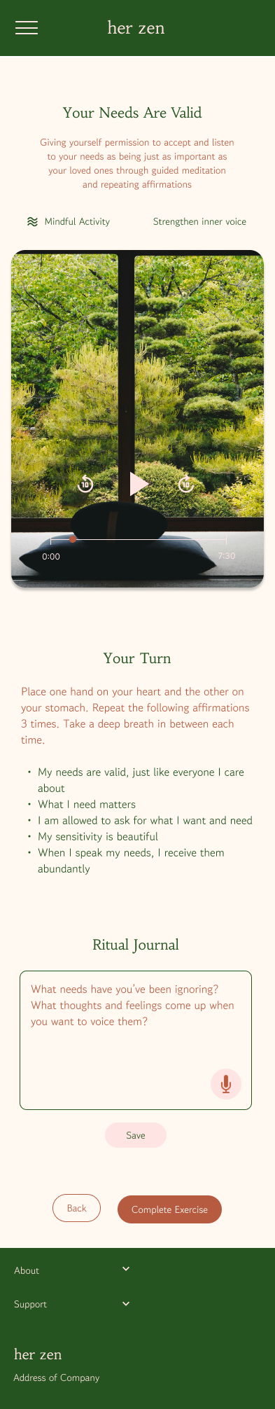
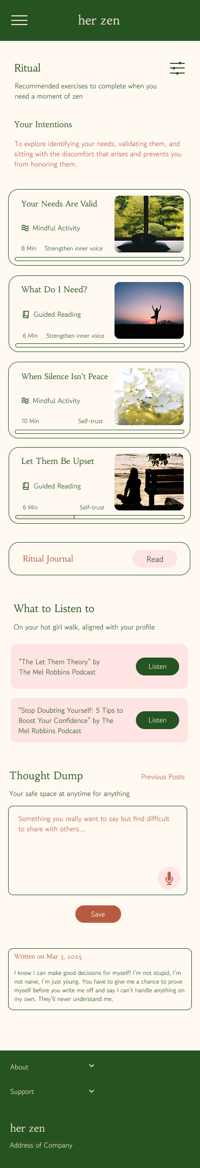
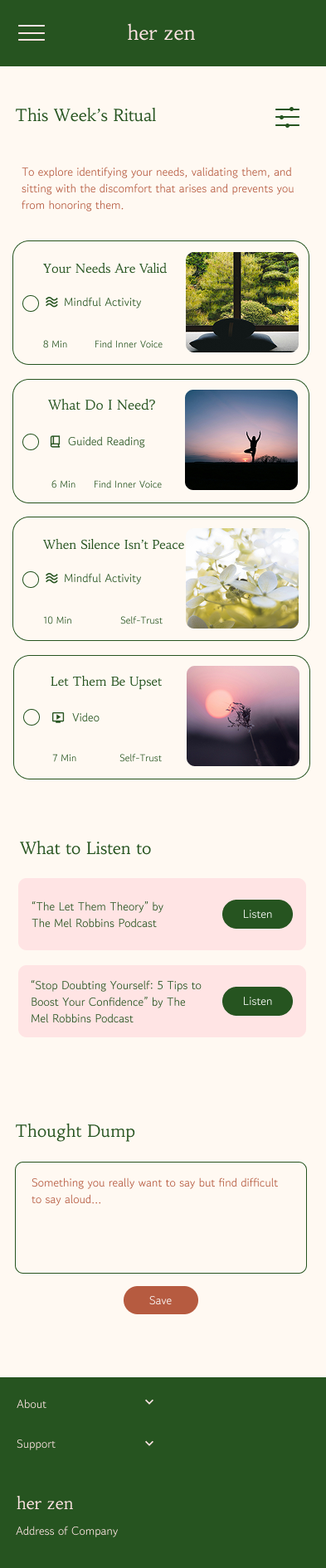
The platform provides a therapeutic approach framework to work through their emotional struggles, by curating a list of recommended exercises, podcast episodes and reflective journal prompts.
The intent is for users to use this as a foundation and later as a frame of reference as they grow on this journey and find other supplementary resources.
Preliminary Research + Conceptualization
User Persona: The Learner

After completing my user interviews, I categorized their answers into themes using an affinity map for user persona characteristics, product framework, and features.
My user persona was defined as “The Learner”:
wants advice and support in the midst of a struggle
wants to learn more about her emotional needs to make finding suitable support easier
repeats old responses and patterns that are self-sabotaging
isn’t feeling confident or competent about which tools to use during mental spirals or a difficult time
Site Map & Task Flows

The sitemap shows her zen’s navigation and taxonomy, highlighting the pillars of her zen to be functional and unique. I categorized the functions based on results from card sorting, and how a therapeutic framework would translate onto a mobile platform.

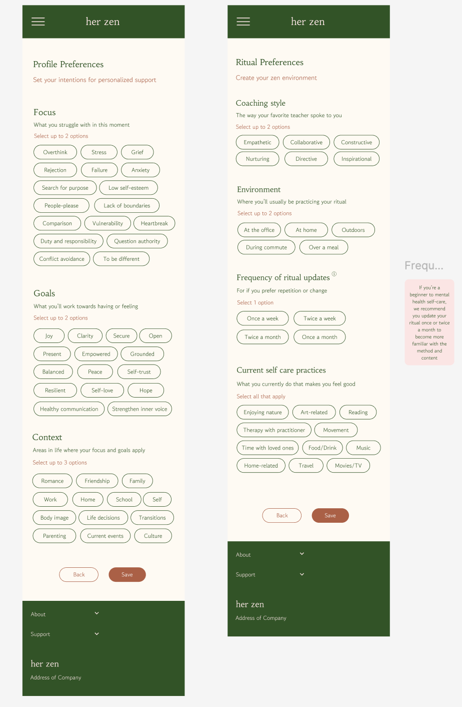
Given the constraints of this project, I chose to build out 2 task flows: select their preferences choices for their user profile; and to select and complete an exercise from the recommended ritual list. I chose to keep it simple and utilize elements to keep the user on the designated learning path.
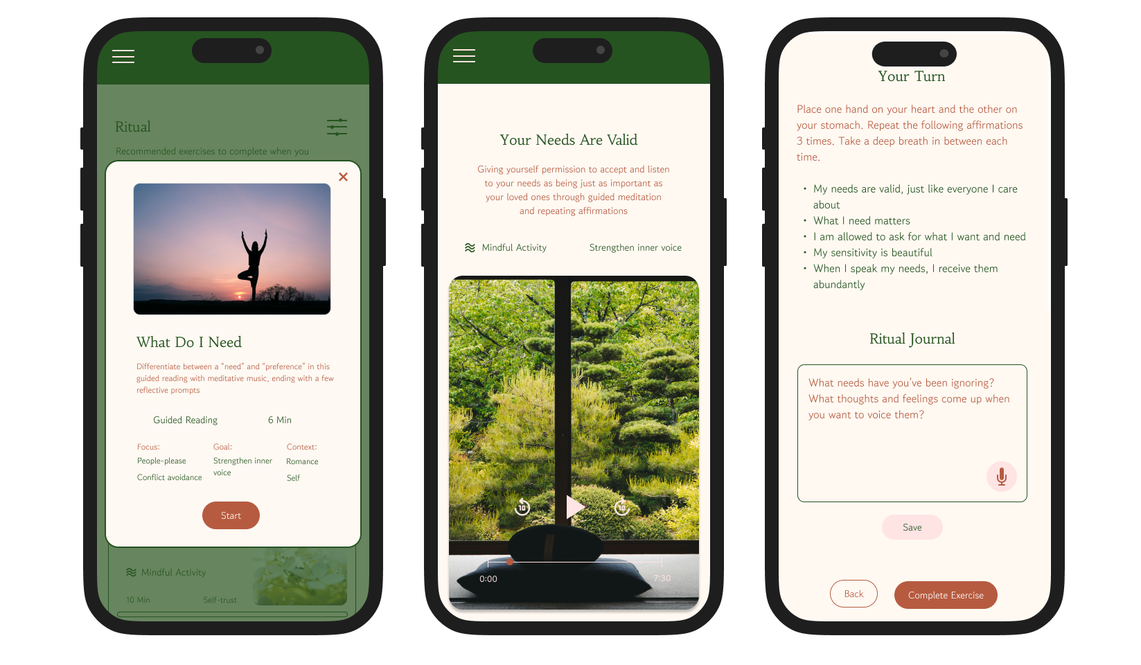
Wireframes
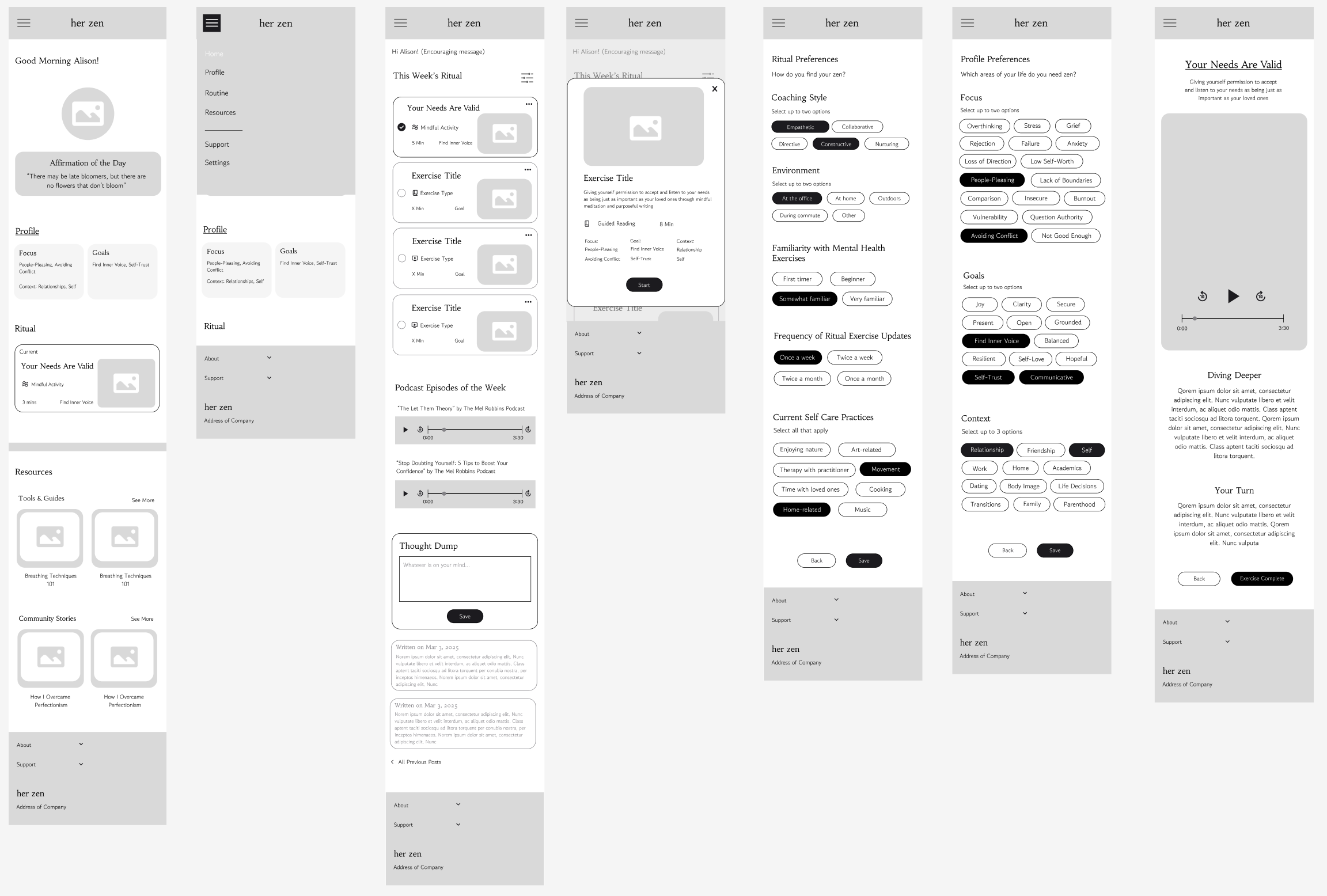
This second version of my mid-fidelity prototype shows the key screens for the two flows:
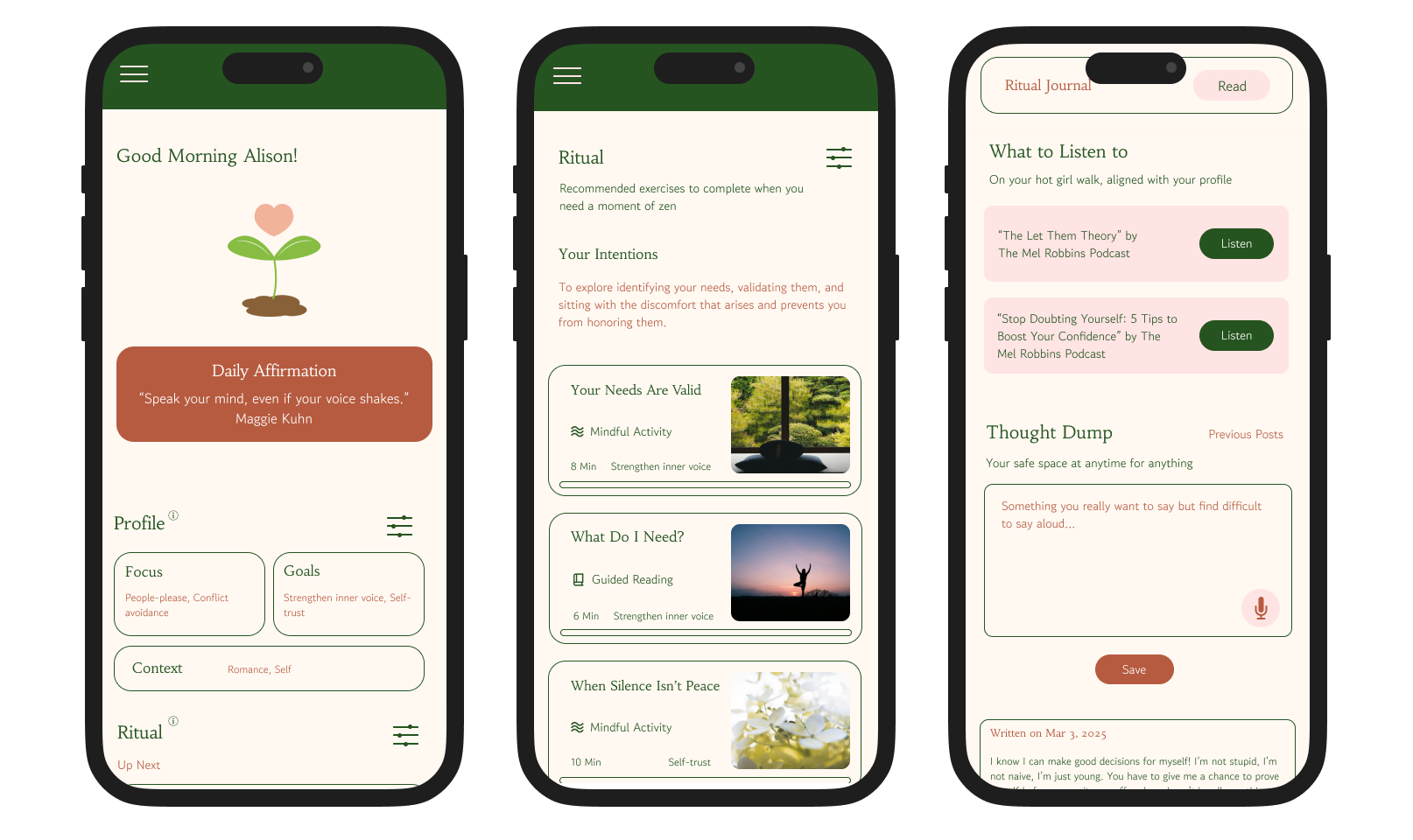
Home Page + Navigation bar, Personal Weekly Ritual page, Ritual Exercise preview, Preferences for Ritual and Profile, Ritual Exercise
I used the Calm app’s interface as a reference for the visual elements and components, where I found their simple, natural and comforting style to be what I wanted for her zen. I wanted the visuals to evoke the feeling of spending time with your wise best friend / older sister or a coach who can guide you through challenging times, where you can trust their guidance and feel safe at the same time.
Goals of the Design
What do I want the user to walk away with thinking and feeling after using this platform?
Provide a therapeutic framework that sets the tone and direction of their mental health self-care journey
Increase their awareness of their individual emotional needs and self
Focus on bridging the gap between intention and outcome rather than becoming “healed”
For content to be personalized to specific emotional needs
Recommended feature to keep the user staying on the learning path
A space to encourage their processing and reflections
Branding
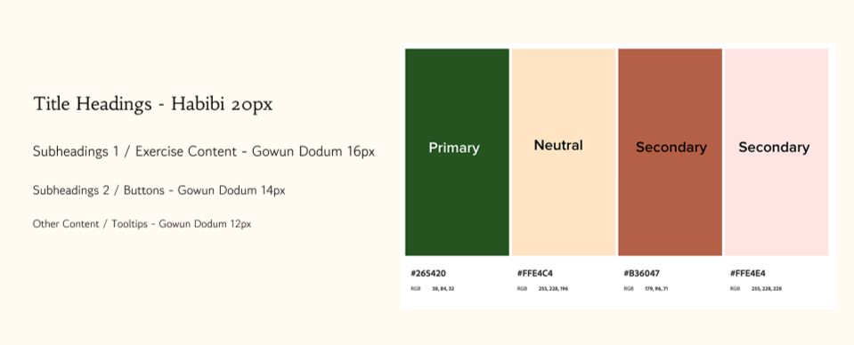
Colors & Fonts
Balance • Embrace • Nurture • Reliable
I believed this platform should encompass these values, which informed my selection of the colors, fonts, and name.
I wanted the branding to highlight the balance women are striving to find in their lives, the natural feminine and nurturing side of women should be focused more internally than purely externally, and gently embracing the ups and downs of a mental health journey. I intended for the visuals to reflect a sense of comfort and calm for the users whenever they used the platform.
Usability Testing
I interviewed 5 women to test the 2 user flows via Zoom. They were asked to:
Select their ritual and profile preferences
Select and complete a recommended ritual exercise
After completing the tasks, they were asked about their thoughts on the preferences available, pain points, and any functional and experiential details that would affect their decision to use her zen again.
Preference Selection
Task success rate: 100% completion rate of under 2 mins, with an average of 2 errors
Satisfaction levels with options available: 3.5/5
Select / Complete an Exercise
Task success rate: 100% completion rate of under 4 mins (without full content), with an average of 1 error
Satisfaction levels with exercise options and design: 3.8/5
Overall experience of her zen
Satisfaction levels: 3.8/5
Things They Loved
Variety in types of exercises and content
“I would want different ways to engage, like listen and write, and this lets me do that.”
“I really like the option of podcasts because naturally I like to listen more than read.”
“I liked having access to resources other than what’s in your ritual to give you the option to keep improving and learning.”
Simplicity and clarity of visual design
“I like how simple and not cluttered it was.”
“It’s well designed and calming, quite easy to read, everything looks clear.”
Seamless integration into current life routine
“This is great, I don’t feel too overwhelmed. These are things I can add into my commute or read before bed.”
“I don’t want the app to add stress onto me, and this is really simple and straightforward and easy to add onto what I already do or like to do.”
Colors
“I love the colors that you’ve chosen.”
“I liked the colors a lot, they were very calming.”
Iterations

Clarity of Elements’ Purpose
Before
After

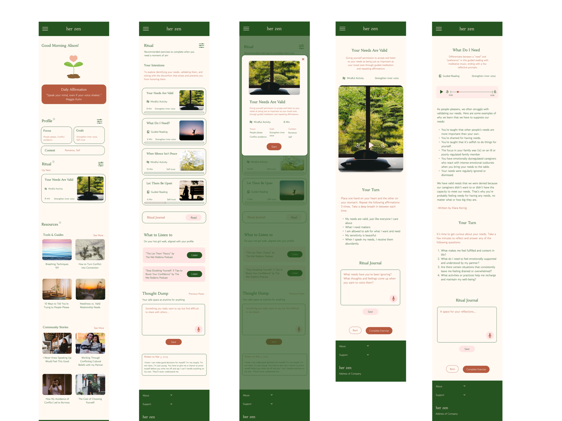
During testing, users shared they wanted a space to write their answers to the reflective questions within the page.
An option for voice dictation was added for accessibility like different preferences of reflective practices.
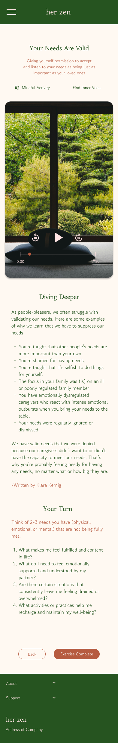
By using the same visual layout for both “Mindful Activity” (moving image + audio), and “Guided Reading” (still image + audio) caused users to feel unsure about what to expect and slightly overstimulated.
As a result, I created two different layouts for each type of exercise that helped the user focus on the right aspects.
Improving Accessibility
Before
After
Testers found the existing titles weren’t clear and asked questions about how the overall framework of exercises worked. While most felt the checklist format gave them order and a sense of accomplishment, it made two testers feel overwhelmed and confused about whether it meant they had to be done in order, and gave yet another “to-do” checklist to complete.
Therefore, I adjusted titles and added subtitles to clarify the purpose and framework of the learning path.
I also changed the checklist format to a progress play bar to inform the user about both completion and progress if they want to go back and finish one.
The Final Product
Highlights of Design
01 Gentle Guidance
The interface encourages personal discovery while giving users just enough support to feel competent and empowered.
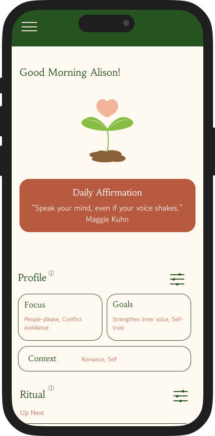
The homepage serves as a preview of the platform and a reference to the user’s unique learning path. The profile and ritual preference options were selected to reflect issues Asian women frequently face. From there, the user will have recommended content based on their “Ritual” preferences.
The guiding principle of my design strategy was to increase users’ self-efficacy, giving them the tools to develop their knowledge so their confidence regarding self-care grows.
02 Focus on User Success
Users can select up to 2 options for their focus and goals, to not overwhelm them with a wide variety. With a smaller scope of content and more repetition in exercises, the user’s perceived competence in exercising self-care should be higher.
The ritual preferences reflect factors that support or deter them from keeping a regular self-care ritual.
03 Learning Path
Since the frequency of updates is up to the user to decide, the set of exercises presented each time would be divided up as learning modules, with a clearly defined learning objective in each one.
To keep the user on the designated learning path, the exercises are assigned, but they can choose the order of completion.
In addition to the exercises, I wanted to provide a more open and passive learning alternative method and chose to include podcast episodes related to the learning module for passive consumption.
Her zen shows their progress of what’s been played or in the process being completed for users to feel competent and in control of their learning journey. Additionally, the in-app “Ritual Journal” serves as a space to encourage metacognitive thinking and digestion of the content.
Reflections
-
This project proved that a platform like her zen is needed and has the potential to be an early intervention for Asian women who are ready to care for themselves regularly and seek structured support that is nurturing and trustworthy. Based on user feedback and personal reflection, these are some recommendations and future steps that could help guide the development of her zen:
-
Some of the suggestions that were given during testing would require more research to determine the severity of need for adjustments, and more insight into our users’ learning behavior.
I’d like to research what prime duration and types of exercises would lead to the highest engagement and viewing rate.
Secondly, is the visual of a plant growing for progress, and the play bar sufficient for motivation? It would be very useful to know whether users prefer a check on their participation rate or position on their learning path.
Lastly, more testing to confirm whether users prefer an automated selection and order of exercises, or as it is now, where users can pick which exercises they want to do from the list.
-
The main differentiating factor from competitors would be the content made specifically for Asian women, addressing the cultural nuances that general wellness platforms may not address in as much depth. Some struggles require a different language, perspective, and tone to make the user feel truly seen and understood, which would highly affect engagement. Future development of her zen would require the support of an expert in Asian women’s mental health to guide the content development and strategy.
-
I received a very warm response from my test users that made me feel very encouraged and proud of this project. When I showed them the final iteration after making edits from their feedback, they noticed the changes I made and were happy to see how I listened and interpreted them correctly.
It tells me that this product is on the right path of development, and with additional content, testing, and iterations, it can significantly support the Asian women's community.