
Mind Hong Kong
Refreshing Mind Hong Kong’s website flow and layouts for smoother and more effective volunteer management
Client: Mind Hong Kong
Tools: Figma
Timeframe: September - October 2025 (65 hours)
Skills: UX/UI Design, Web Responsive Design
About
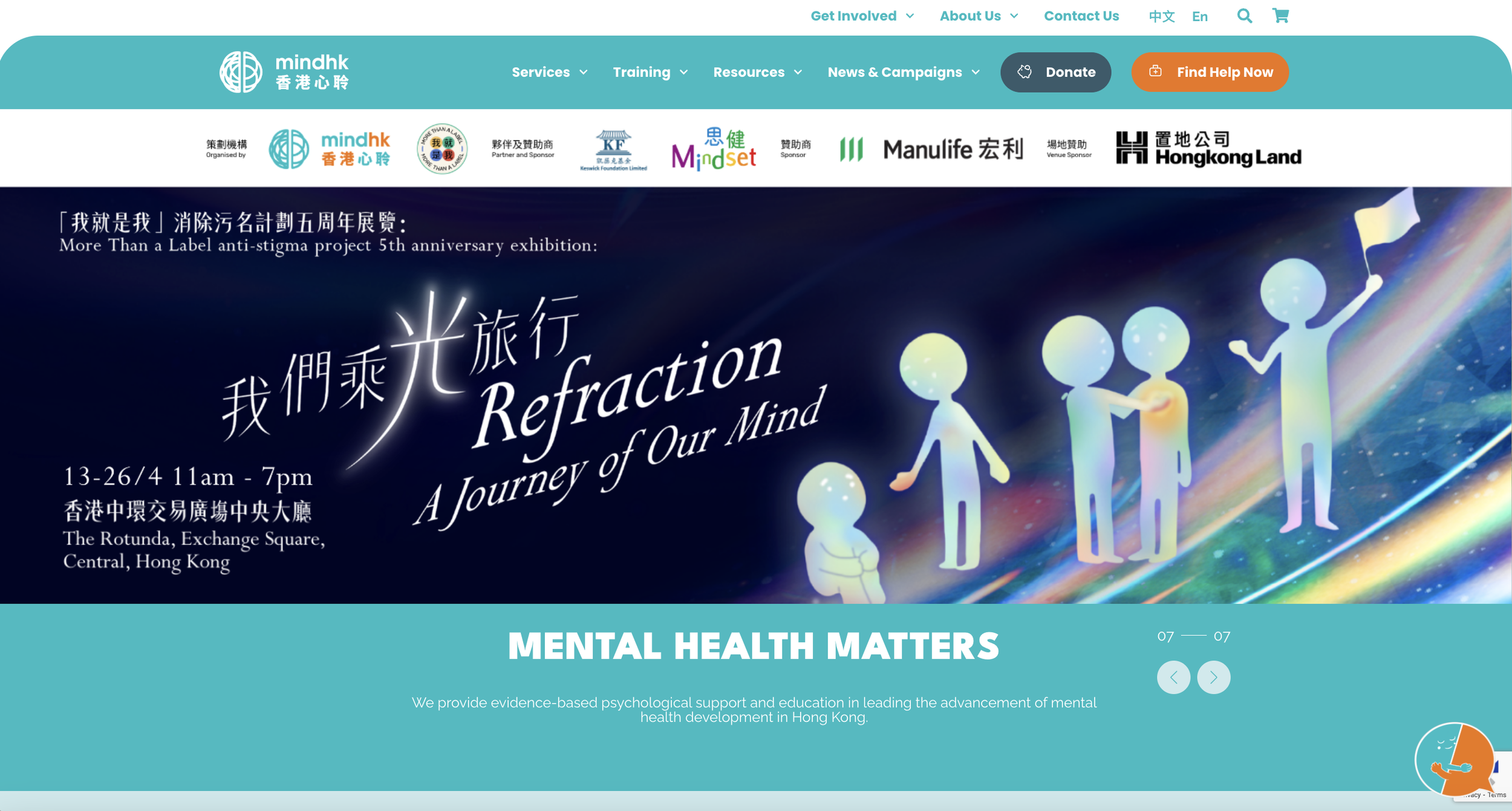
Mind Hong Kong is a NGO whose mission is to provide evidence-based psychological support and education in leading the advancement of mental health development in HK. They work to improve awareness of mental health and mental health conditions, remove the associated stigma, through community and corporate events, and individual talk therapy.
The Problem
At the moment, Mind Hong Kong’s volunteer recruitment and organizational methods on their current website is not sufficient for their management and program logistical needs. They are looking to collect more information from volunteers to help with task allocation, and manage them more seamlessly for a variety of events.
The management of volunteers after sign-up and in-between events lacks organization and leads to volunteers feeling confused, under utilized, and unengaged.
The Question
How might we make the organization of volunteer information and task allocation more transparent and collaborative?
The Design
This design focuses on strengthening the touch points Mind HK has with potential and current volunteers and ambassadors, and improving the visual and information architecture of their outreach involvement content.
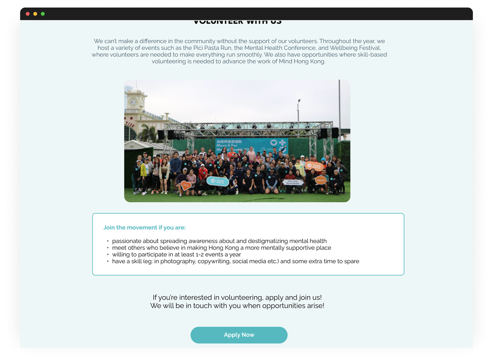
How to: Sign Up to be a Volunteer
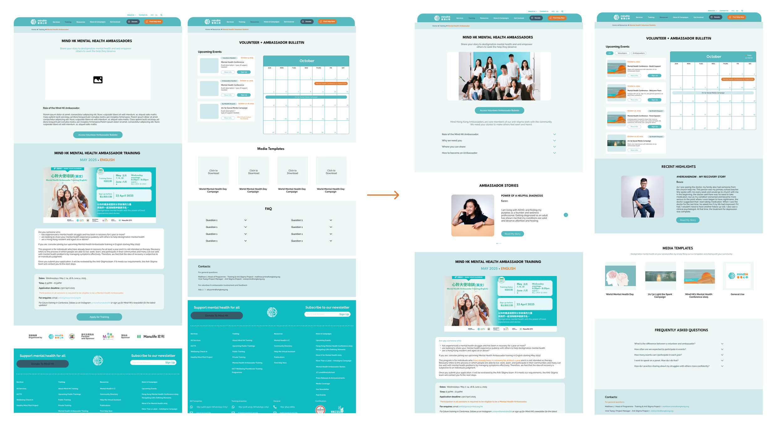
How to: Access the Volunteer + Ambassador Bulletin
Improved volunteer sign-up form to ask for necessary details to match them more appropriately for events
A new page to host a summary of all involvement methods
More details on commitment and tasks required
A new page for volunteers and ambassadors to find all housekeeping and involvement information
Features
Preliminary Research
Competitive Analysis
I conducted a competitive analysis on 4 other mental health focused NGOs to review their website layouts and organization, and positioning to users.
These included: Time Auction, KELY Support Group, JED Foundation, The New Normal
Heuristic Evaluation
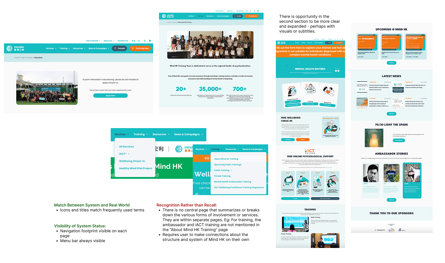
What Isn’t Working Right Now
There’s missing links between volunteer, home and get involved pages in terms of usability and content
The sign up form is missing questions that support task allocation and availability of volunteers
Volunteers need a place to access the corresponding information of how to be actively involved in Mind HK and be appropriately and easily matched for programs that take their availability and skill into consideration.
No information on the "Volunteer" page other than a signup form. The Google form does not specify what type of events volunteers would be a part of, or a place to mark availability.
The differentiation between role and purpose of volunteers, ambassadors and trainings is unclear.
Key Research Insights
The purpose of my user research was to:
To identify the expectations, motivations, and pain points volunteers face when engaging with events and organization before and after sign up
To identify the volunteering recruitment and management process with MindHK Staff who deal with it primarily and secondarily
*Unfortunately, while I was arranging interviews, I was asked by Mind Hong Kong to only interview volunteers/ambassadors and not their staff due to their work load at the time of project. And so the project design and outcomes shifted to support volunteer needs more than Mind HK staff needs.
Clear communication and information about events and logistics regarding how to be involved as a volunteer
Consistent encouragement and check-ins from Mind HK to grow and maintain engagement
Multiple opportunities to sign up and participate in events throughout the year
To have a point of contact or go-to page for information to orient themselves within the organization and its happenings as a volunteer
To be treated differently to the general public, in terms of communication and care from Mind HK
To be utilized after sign up in a proactive manner
NEEDS & EXPECTATIONS
After sign up, unclear on how to be proactively involved in events and activities without available channels to do so.
The outreach and communication methods seem inconsistent and not transparent. Many don’t know where to go or who to contact for more information and questions about events, involvement, logistics.
Passively waiting to be called to action in-between events, makes them feel disengaged and unable to plan ahead.
With the current methods of communication via Whatsapp group, they have missed messages easily and missed opportunities that they would’ve wanted to be involved in otherwise.
CHALLENGES
“When I have a spare moment i will think, ‘Oh how can I be involved’, and I want to have a landing page to visit to see what I can be a part of.“
“I feel like I’m bugging Vicky and Grace because I don’t know where to find the information”
“They always seem to be looking for a specific type of Ambassador that I don’t qualify for”
“We want to play but waiting in the locker room”
QUOTES
Conceptualization
With that problem in mind, I thought the edits and new pages needed to have content that increased users’ understanding of the structure and system of Mind Hong Kong, spaces to reference often for role and logistical information, and opportunities to participate in passive community engagement.
Design Needs
New Design Must-Haves
Prioritize connection and engagement to community and organization
Inform users with relevant information encourage decisions to engage
Show others in the community to promote a sense of belonging and motivate participation
Provide multiple options for engagement
Show users their unique needs are taken into consideration
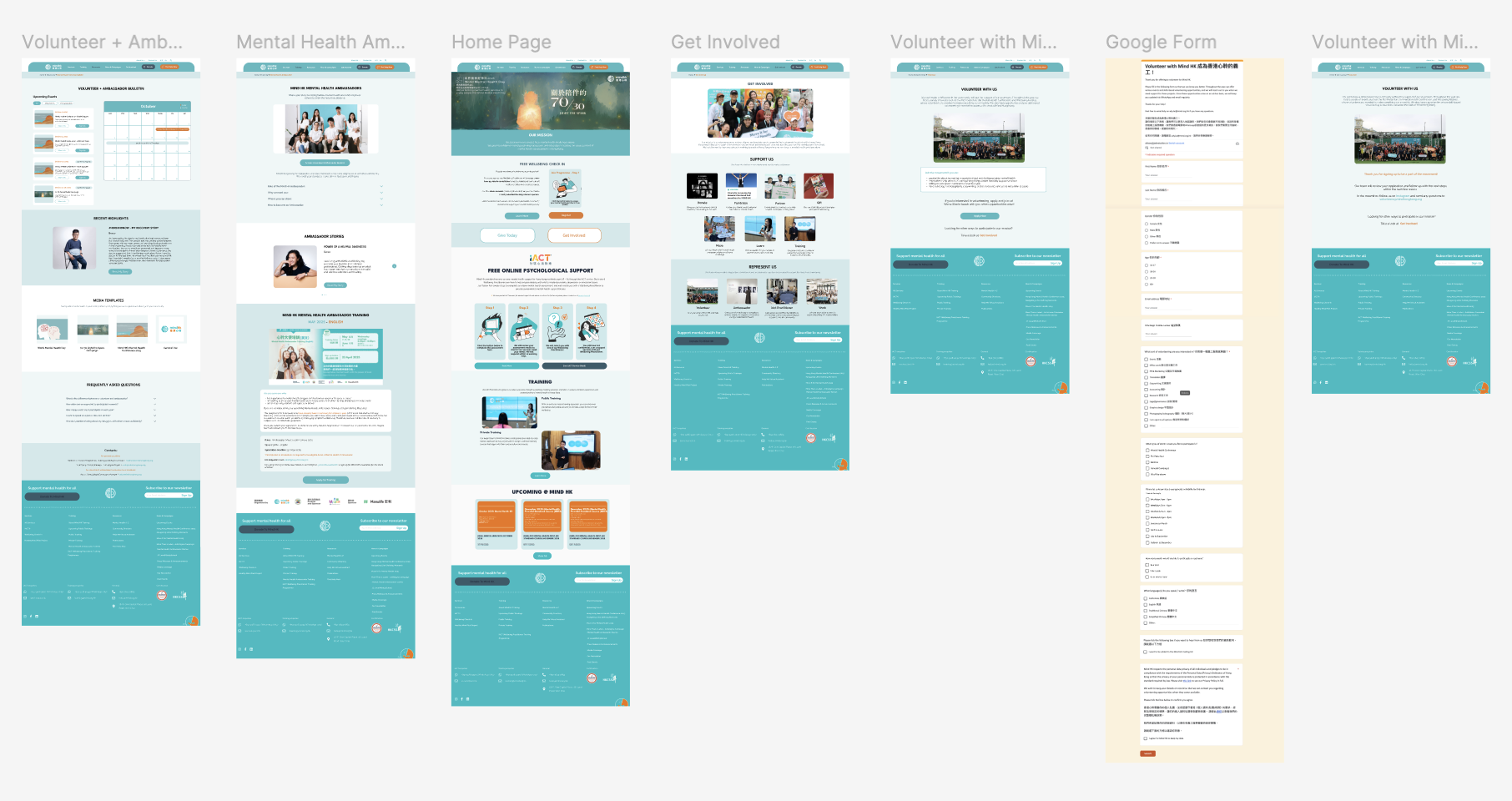
Pages to Design/Improve
Current Pages: Home page, Volunteer page, and Mental Health Ambassador page
New Pages: Get Involved page, Volunteer + Ambassador’s Bulletin
Current Design Considerations:
Based off of the current page's main categorizations, where additional pages are placed within them
Limit up to 5 sections on each page
Center alignment
Keep the same navigation pattern, low interaction behavior, just add on content restructuring
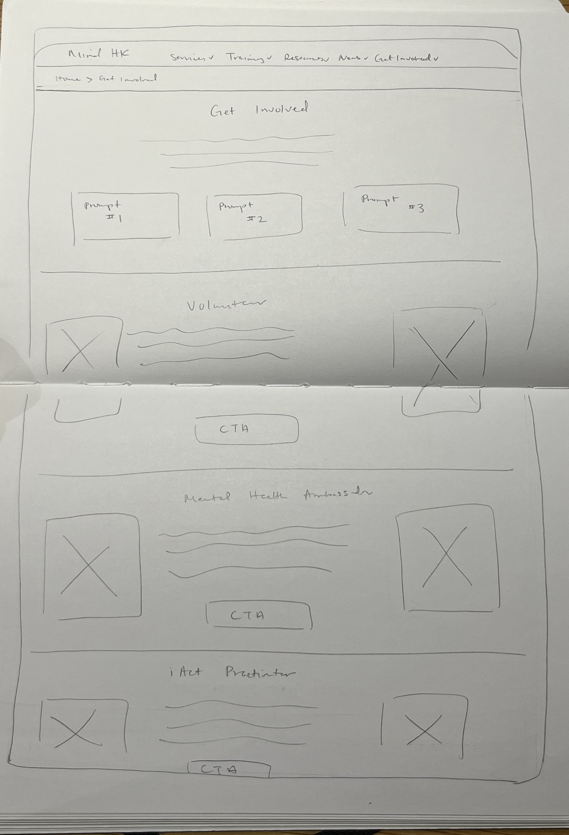
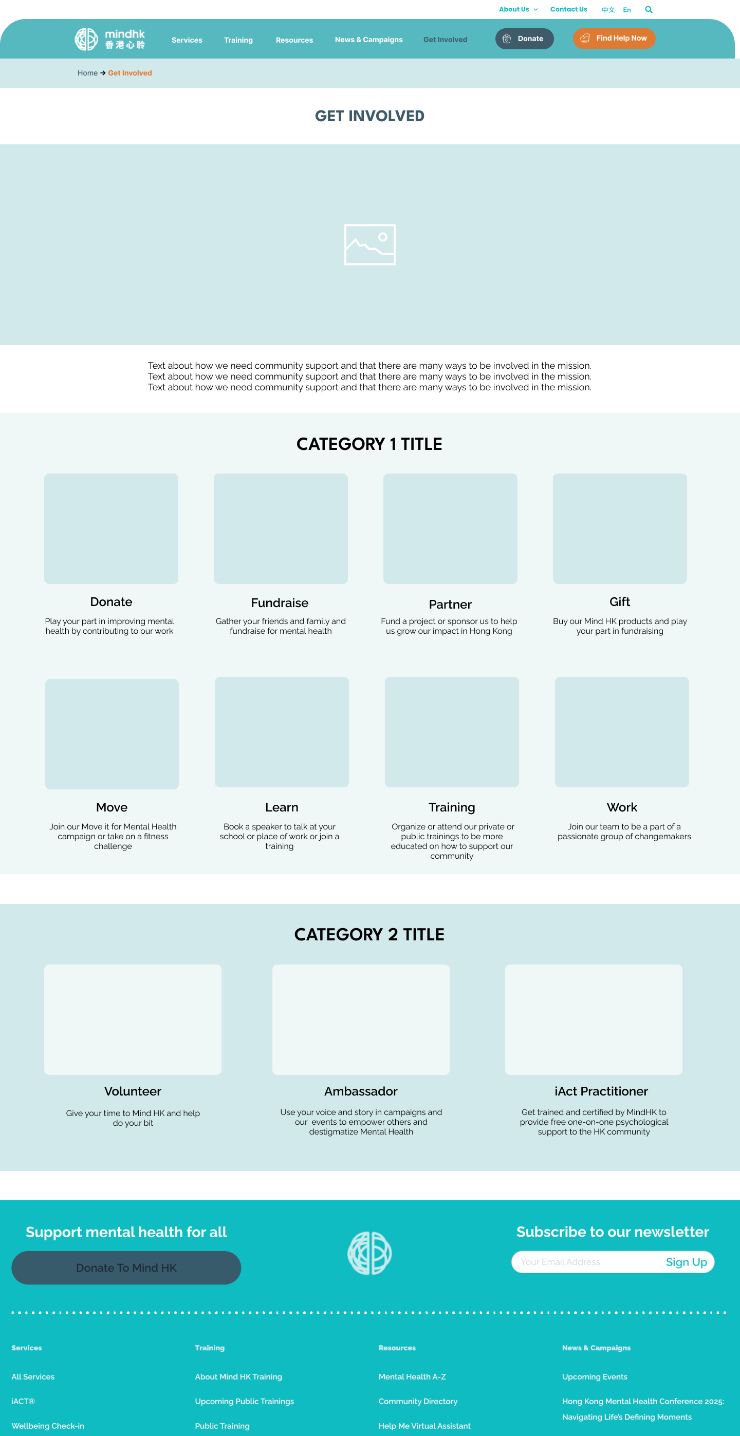
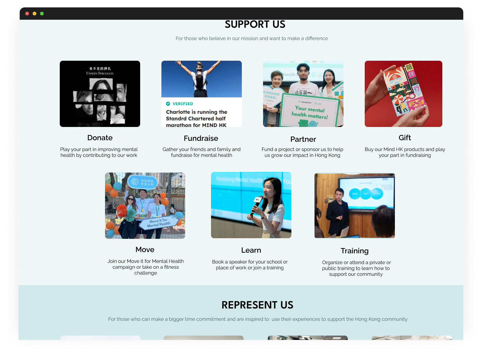
Get Involved Page
To present all available methods for involvement
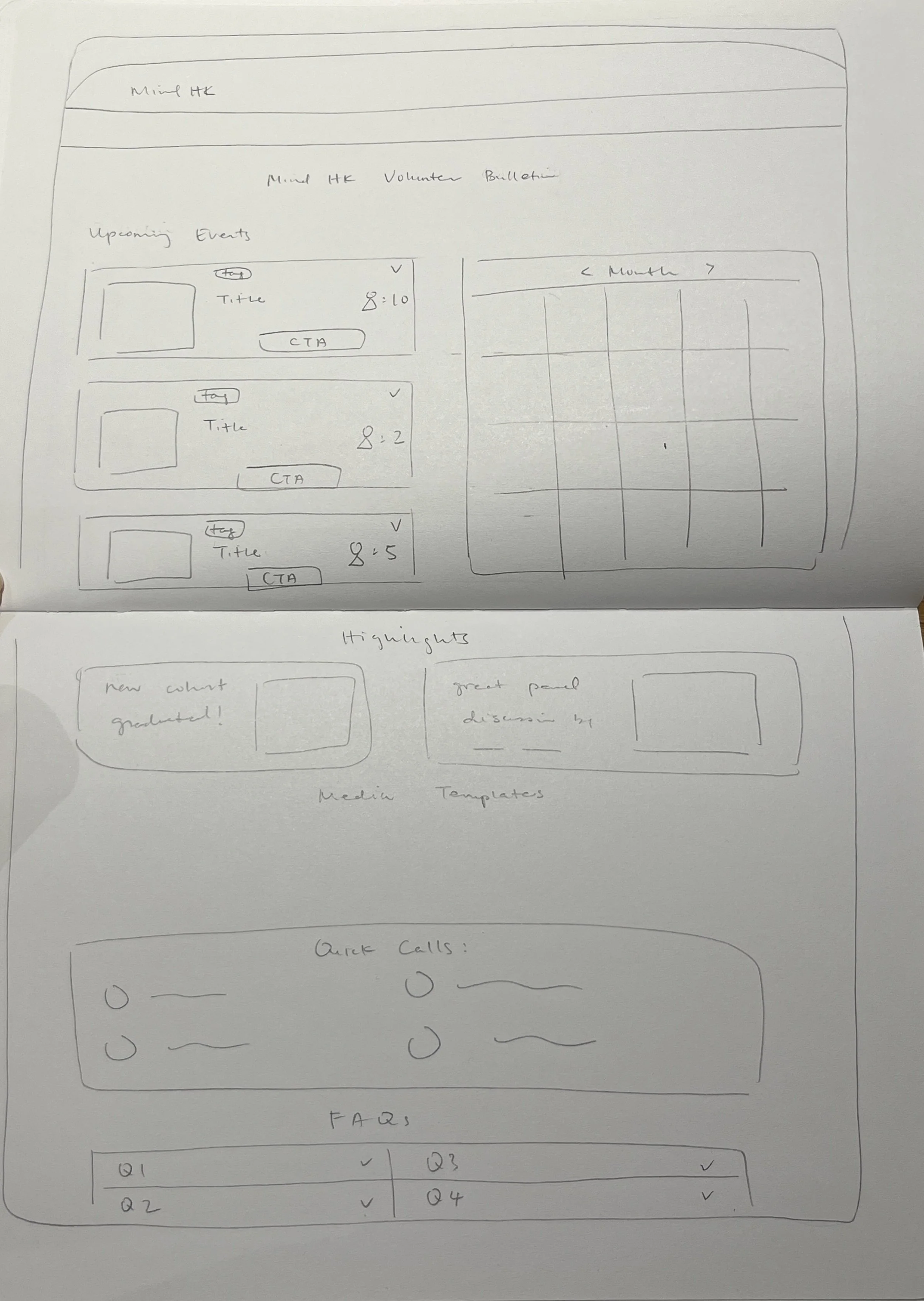
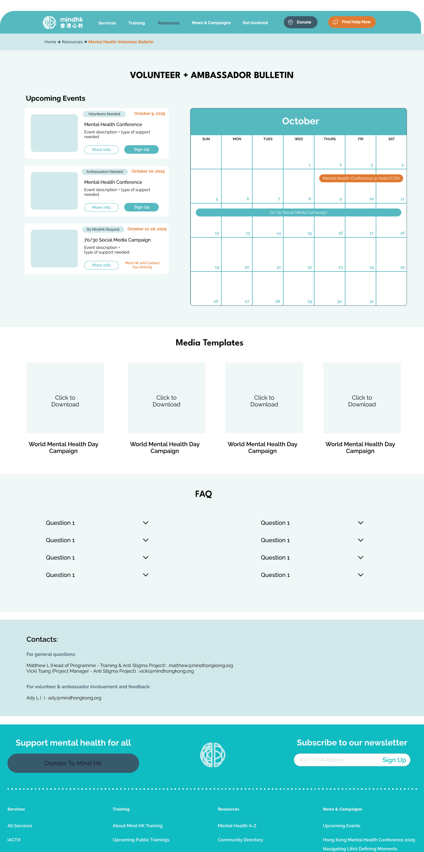
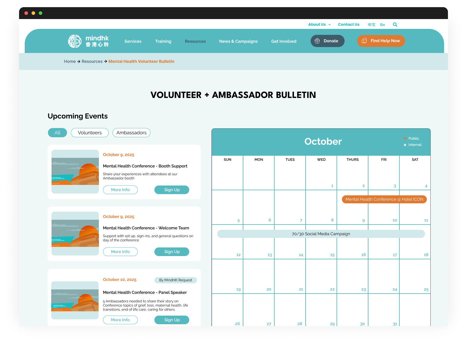
Volunteer + Ambassadors' Bulletin
To be a designated space for volunteers and ambassadors to find updates, event and contact information, FAQs, and community highlights
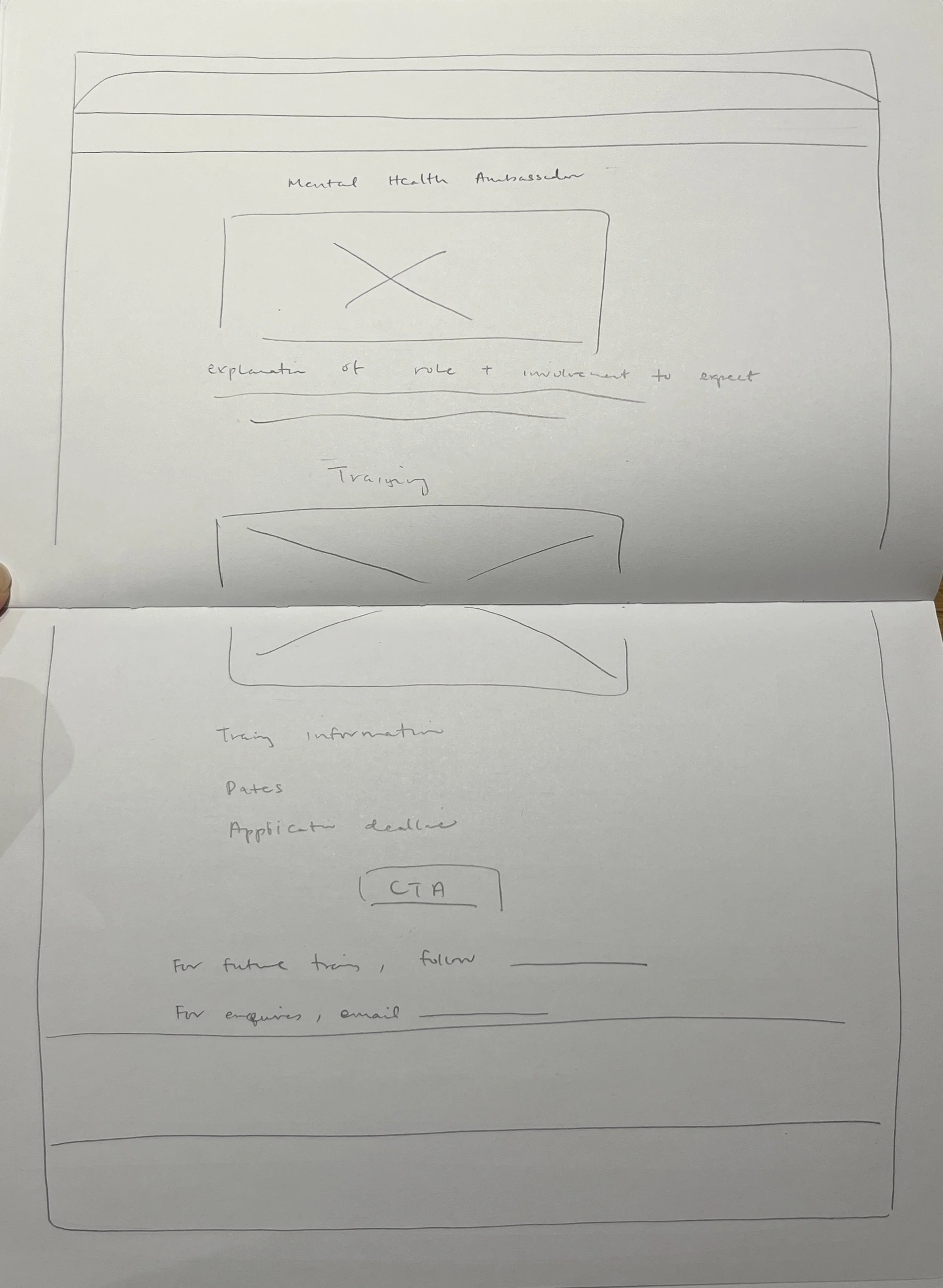
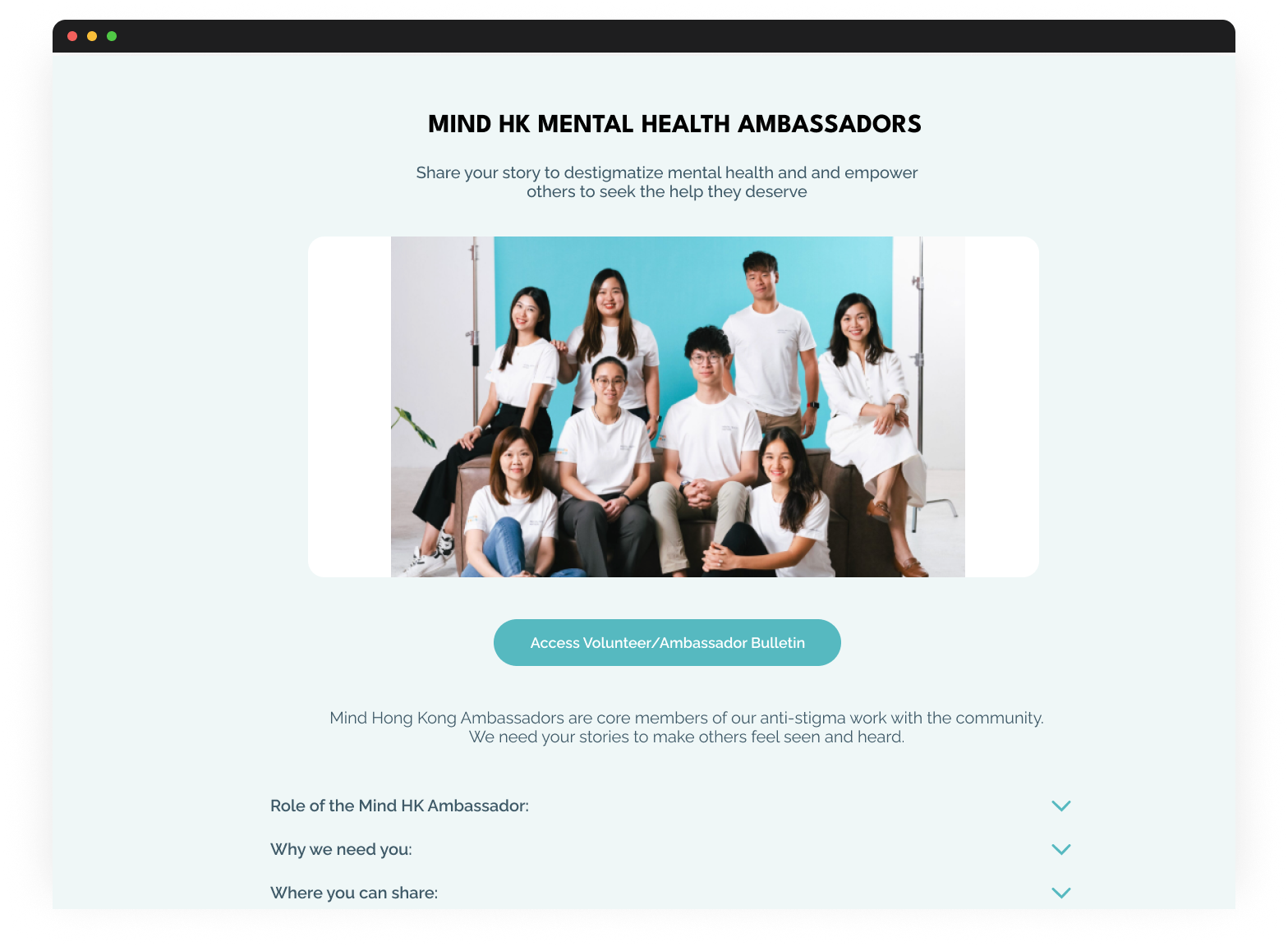
Mental Health Ambassador Page
To include role and training information
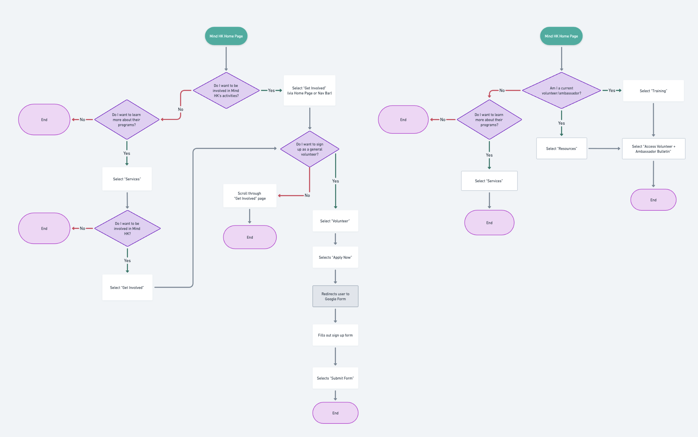
User Flow
I mapped out the following two flows to start to address the different purposes of users that Mind HK was taking into consideration.
To Find Information from the Volunteer/Ambassador Bulletin & To Sign Up as a Volunteer
Prototyping
Challenges:
Since I was unable to interview Mind HK staff, I acknowledge the designs are focused on the needs of the potential and current volunteers and ambassadors.
There was also an additional deliverable requested at this stage (a Donation page) which sidetracked my progress for this project. And so, to remain within the time constraints, I chose to keep my edits relatively simple and essential. While I wasn’t designing anything for internal usage, I still kept in mind what level of understanding users needed about Mind HK’s programs and system for the staff to manage them more effectively.
I’m highlighting the two new pages I designed: Get Involved and Volunteer + Ambassador Bulletin.
To see all the options of involvement on one page, that would make it easier to evaluate and understand the framework of public engagement with Mind HK.
This page format was suggested by Mind HK as it was something they already wanted to test.
Splitting up two forms of engagement into two categories for clarity and quick association → one is more passive involvement, the other more active involvement
This would help differentiate forms of engagement and commitment for the user to decide what’s best to participate in.
Calendar/event list: Users can refer to it frequently and use to sign up, and differentiate which events are for which role.
Address user’s organizational needs since many would miss Whatsapp messages and emails
Templates: Giving users tools for online ambassador work. Through more individual participation, it will also build up their confidence for when they are ready to go to in-person events.
Users can address the confusion over how to participate as an ambassador when not participating in exhibitions or panel discussions
User Testing
Due to time constraints, I created a mid-fi prototype and chose to test the content and UX process via Google Form survey. The focus of UX I’m interested in testing were the components and layout, not so much the journey in between pages, that’s why I believed using a survey to test, with wireframes to reference, would suffice.
I tested 6 individuals, 3 of whom had also completed user research interviews and were Mind Hong Kong volunteers/ambassadors.
My goal was to evaluate the usability of the wireframes per page and gather feedback on improvements of process and UI elements.
POSITIVE
Clarity of layout
Organization and presentation of content
Purpose and content of pages
“I like the upcoming events are next to the calendar. more practical for someone looking to see what days they are free and if there is an activity that aligns with their schedule.”
EXPECTATIONS
Follow up from Mind HK after sign up
More details about role responsibilities and commitment required
More visual support for details
“The time rough time commitment of what volunteering requires (e.g., a 'one-off' or continuous 'light', 'intensive' volunteer commitment)”
PAIN POINTS
Questions about categories in “Get Involved” and “Media Templates”
Insufficient information to make appropriate choice for involvement
Calendar usability — difference in words and filters
“Testimonies would be helpful to provide inspiration and confidence to aspiring mental health ambassadors”
Final Product
A majority of the improvement feedback were content-related suggestions, which meant my user-design was quite successful. The general updates after testing I completed were adding images, writing clearer titles and subtitles, adding description and context of roles and FAQs
Edit #1: More Community Stories/Testimonials and Work Showcase:
Testimonials from current ambassadors would be helpful to provide inspiration, confidence, and insight into the role. Respondents want to see personal stories from ambassadors and volunteers, such as an "ambassador of the week newsletter," to humanize the experience and demonstrate the importance of the work.
Edit #2: Filters for Events:
There was uncertainty about the meaning of the orange and blue colours on the calendar, and a suggestion was made for a filter or colour-coding to easily distinguish between volunteer and ambassador-specific events.
Edit #3: Commitment and Training Requirements + Impact Scope
They want to understand where ambassadors can make an impact (e.g., schools, work settings) and how ambassadors have helped in the community + Details on training requirements, time commitment, post-training expectations, and whether there are regularly scheduled meetings for the community of ambassadors are requested.
Reflections
-
Creating something for a cause that I personally believe in with an organization I’m also involved in was very rewarding.
Speaking to fellow volunteers that I also know, they were more willing to share real feedback because they knew I was working on this project out of passion as well
-
In the middle of the process, my client asked for a different deliverable instead, one that wasn’t based on the research I had already completed. Therefore, I had to quickly pivot to complete this deliverable before carrying on with the original project I was working on. Thankfully they didn’t require any background research and just wanted a deliverable, so I was able to accommodate their requests. Due to the shift, to complete both deliverables extended past the time that the client and I agreed upon. So the original project deliverable was then completed mainly for my portfolio.
Another challenge I faced was while the design brief stated that they wanted the deliverables to be for internal and external usage, my client supervisor discouraged me from interviewing the staff that would be using it internally during the research phase due to conflicting commitments. Without their input, it was very difficult to design pages for them as well, and so I decided to design the pages for external usage based on the interviewees responses.
-
Their main needs were to feel informed and connected to the Mind HK organization and community. The way I addressed this was by creating two new pages that provided more information about how to be involved, tools for ambassador work, more community stories, view events and sign up ahead of time, and guidelines about the roles.
-
As mentioned before, due to the changes in the brief, the project ended up being mainly for volunteers & ambassadors. Therefore, I had to make pages fully for external usage, but still kept internal usage into consideration and how the information provided or collected would improve the staff’s organization.
Initially I wanted to embed the form into the page, but was advised not to. So instead, I included a few more questions where the answers would help the staff categorize volunteers even further for specific events or opportunities.
Rather than a internal database page for management, I opted to create a volunteer and ambassador bulletin page that would provide important information, highlight other members, address frequently asked questions, and downloadable social media templates. I felt that this would address the users’ need for clarity and connection, while also offloading some questions for the staff and pressure to have a constantly open channel of communication.
-
To stay detached from the deliverables and dedicated to the process
To be ready to pivot at any time, but to always remember the users’ needs
If I’m working with a client, their needs will come before your vision
-
Videos or drawings see what each program feels/looks like to help visualize participation
More information on the time commitment, effort and skills
Connecting the bulletin to an internal database that shows each volunteer/ambassador’s profile and their involvement and preferences
Incorporate community forums
Adding a password protection to access volunteer + ambassador bulletin to include more exclusive content
Have pop-up or separate event pages for more details and specific needs