OM Health Hub
Educating and empowering women with a mobile app that simplifies and scaffolds a personalized health learning journey
To supplement a precision health education platform with curated content and tools tailored to individual health needs, strengthening users’ understanding and voice.
Client: OM Health Hub
Tools: Figma
Duration: Jan - Mar 2026 (100 hours)
Skills: UX/UI, Product, Visual and Interactive Design
About
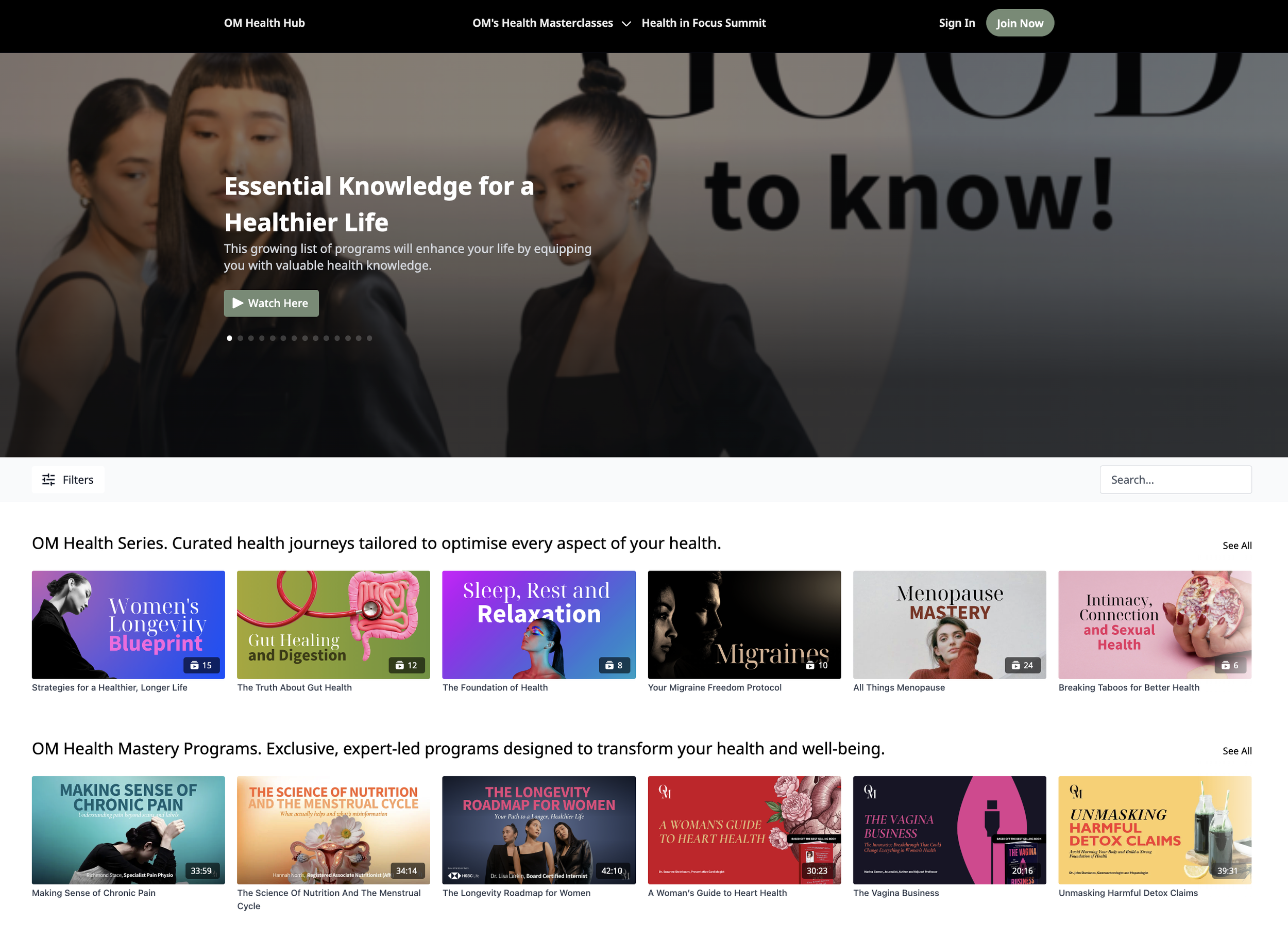
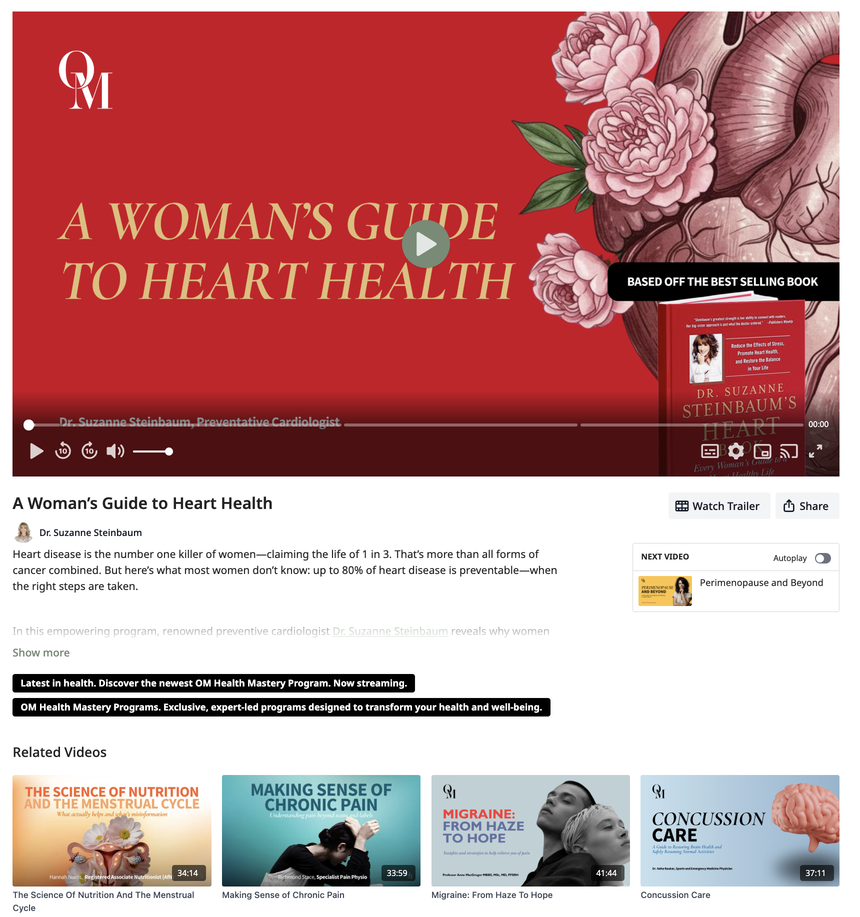
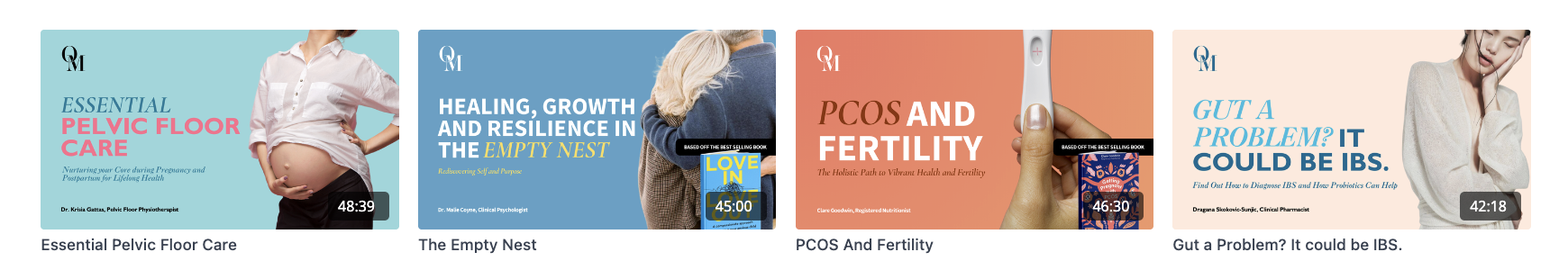
OM Health Hub is a B2B precision health educational platform that hosts a library of long-form videos about health topics, ranging from perimenopause to migraines to heart health. The topics are taught by top experts and researchers of the field, providing informational and practical support in a systematic format.
OM Health Hub strives to give women and men easy access to reliable, holistic, and unbiased knowledge about their health to make empowered decisions and proactively care for themselves.
The Problem:
Users are overwhelmed and misled with health information from wide variety of sources, creating a short term reactive approach to caring for their health.
With the wealth of information available within OM Health Hub, users are having difficulty translating and discerning knowledge into a holistic care approach and practical daily rituals suitable for their unique health needs.
The Question:
How may we turn complex health information into simple content and daily habits that shift fragmented knowledge into whole-person care?
The Design
A mobile app that provides a symptom-to-context curated library that follows a top-down approach. Users are led on a learning path that scaffolds the knowledge to develop a holistic understanding of what they’re facing, and taught practical steps for effective application.
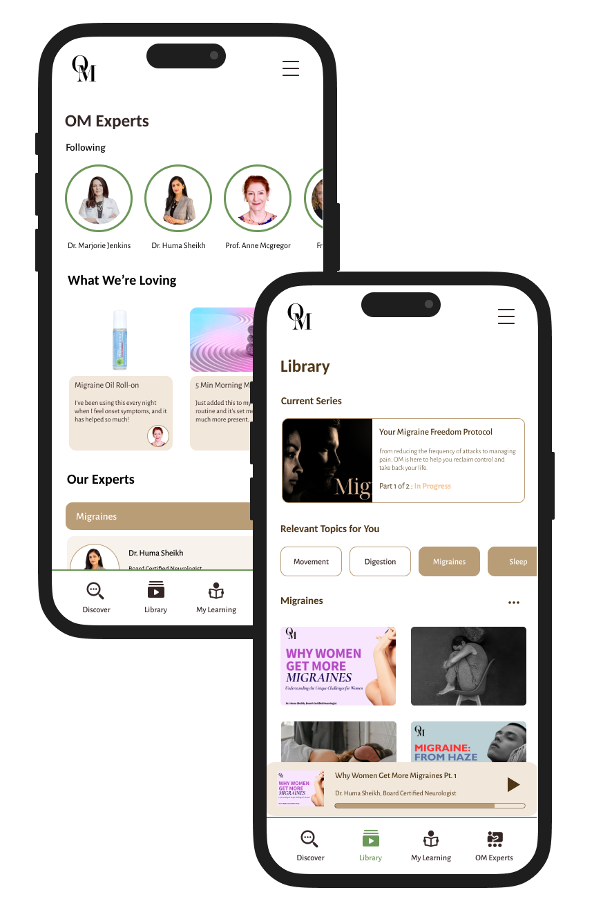
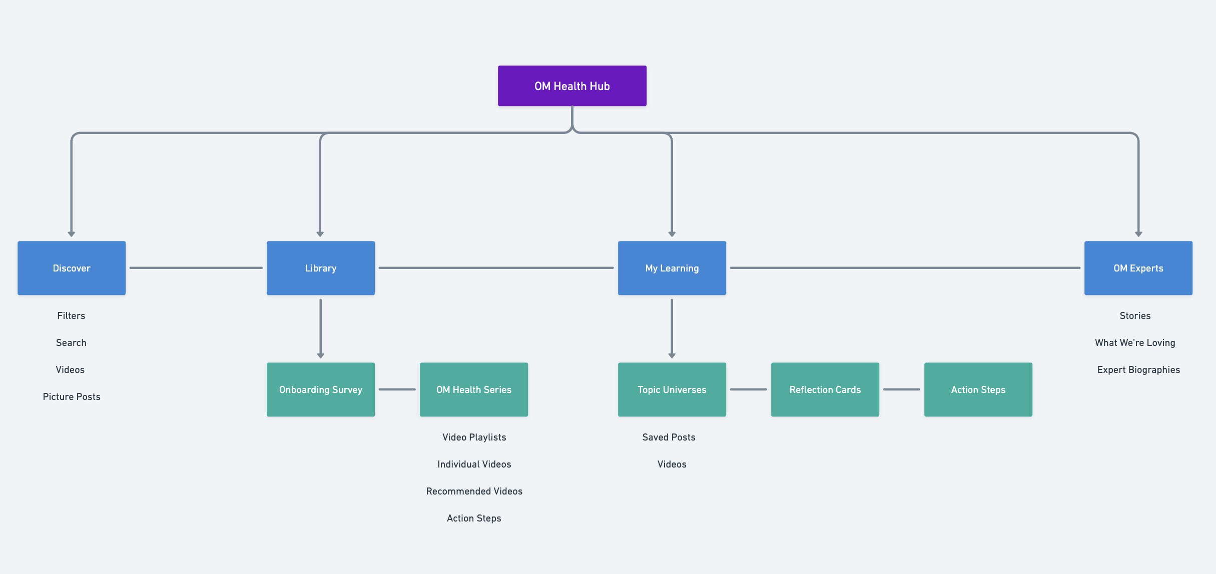
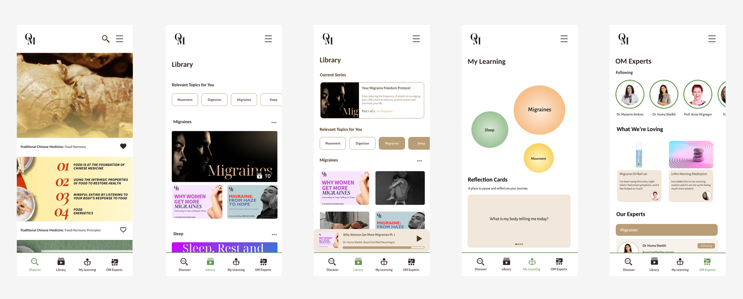
Features:
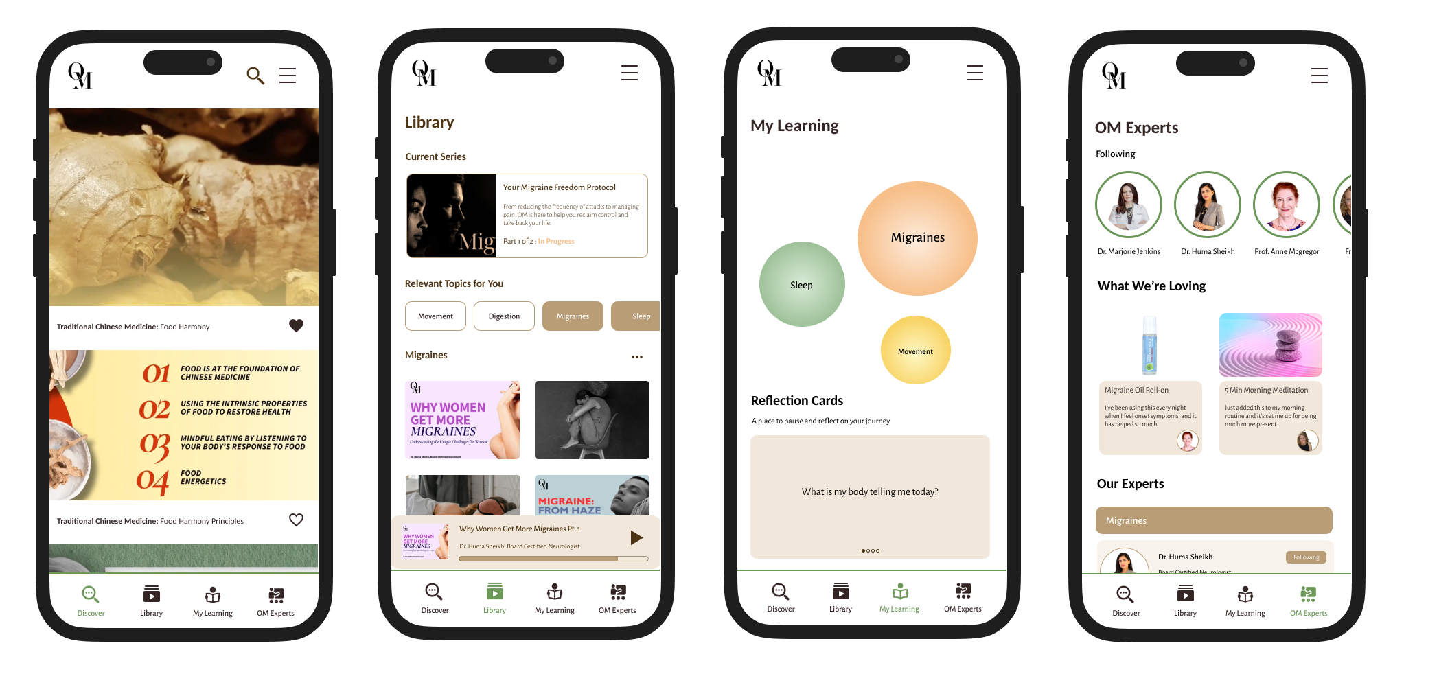
Discovery: Explore all content and topics on OM Health Hub
Library: Curated videos and playlists based on user’s health needs
My Learning: Saved content, action steps, and reflections
OM Experts: Recommended resources and live stories from OM Experts
Preliminary Research
Key Learnings from Competitive Analysis:
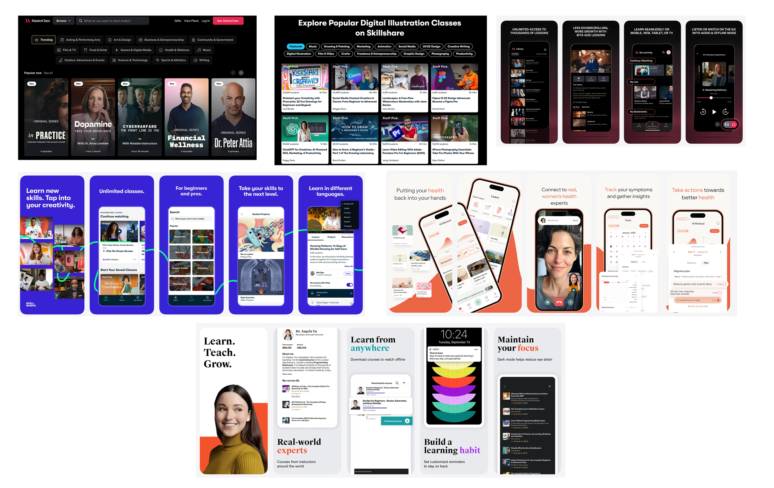
I reviewed Masterclass, Skillshare, Udemy to identify their content and design features for conducting large-scale online classes, while maintaining a standard of quality and depth in learning content.
Huge library selection of topics to choose from, addressing beginners to advanced level learners
Practical skills vs. theory: Differentiate customer base and format of teaching
Platform needs to provide more than just learning content, but also addresses post-watch engagement and how user synthesizes the knowledge with application
What Isn’t Working Right Now:
Users want shorter previews, clearer relevance up front, better filtering, and a more approachable tone and visual systems
They don’t be left to connect the dots themselves.
Where to Progress and Create Value in OM:
Offer short form in addition to long form content
Highlight important learning points that user can refer to easily after watching
Provide additional assistance/features on how to use the new information learned + Scaffold more of how they can use this new information in their daily life
Not just increasing knowledge, but also improving awareness of self, decision making, discernment, self-advocacy
User Interviews
To research about their health mindset, current health context, learning and engagement habits, application of health knowledge to daily life, barriers to making change, and what increases their trust in a source.
Key Research Insights
People want personalized guidance, not generic tips
Make sense of nuance and understand the “bigger picture” instead of isolated advice
Balance proactivity and avoiding information overload → right amount, right time
Fast, skimmable answers, with optional deeper detail
Short, bite-sized learning with visuals
Feel tangible change quickly through small steps that move one towards a clear goal
Biggest barriers are time, effort & choice overload, low urgency without pain
User Persona: The Symptom Navigator
Mindset + Context
Feels partly in control, but unpredictable symptoms create stress.
Wants to “zoom out” and understand patterns, triggers, and the bigger picture.
Goals
Figure out what’s happening and what to try next.
Reduce uncertainty and avoid spiraling into worst-case conclusions.
Prepare for better conversations with professionals (what to ask, who to see).
Pain Points:
Online info feels extreme, alarmist, or not specific enough.
Too much information becomes overwhelming.
Wants personalization that accounts for medical history, but not a “diagnosis machine.”
Conceptualization
Goals of the Design
Shift from short-term reactivity to a proactive long-term care approach
Make the learning content engaging and sticky
Digest health knowledge and translate it into practical steps
Feel empowered by the knowledge
Build daily rituals to improve lifestyle
Get personalized recommendations and have their learning journey be scaffolded by health experts
A ritual building experience that feels rewarding and empowering, not overwhelming or sterile
Discovery
Access to wide library of all topics
Library
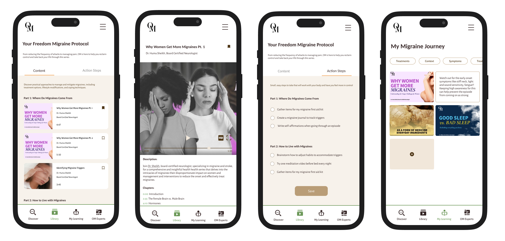
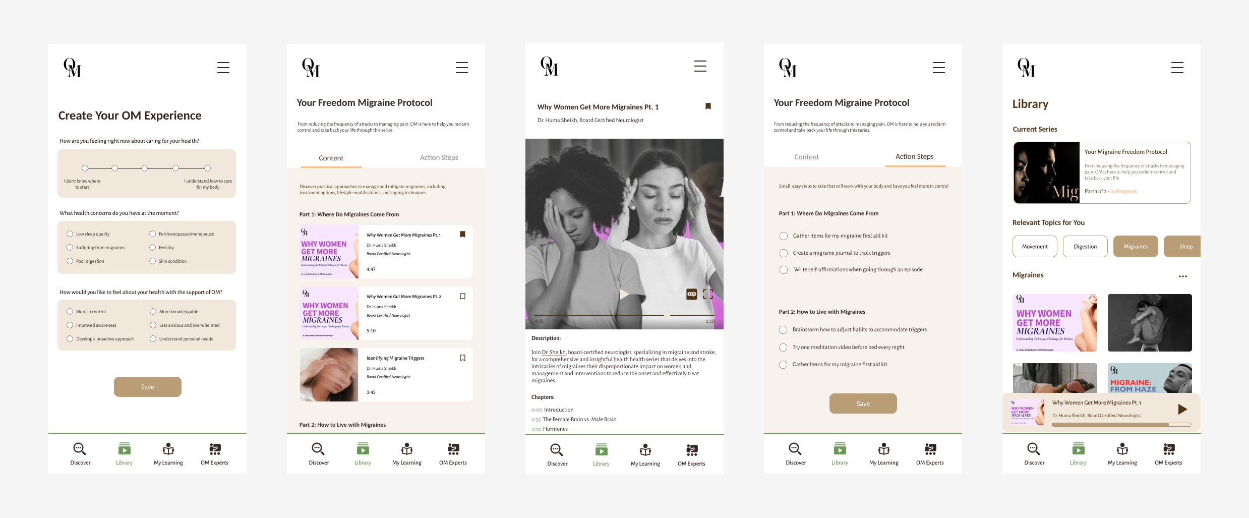
Curate videos that are suitable for personal needs + action steps to supplement learnings
My Learning
Personal profile for saved content, action steps, and reflective questions
OM Experts
Personable access to OM’s health experts
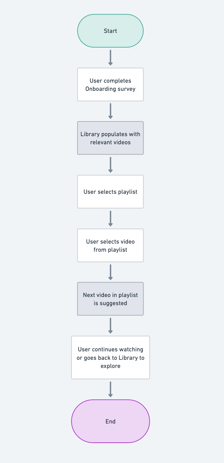
Task Flow
To create a profile and watch a video from curated playlist about migraines
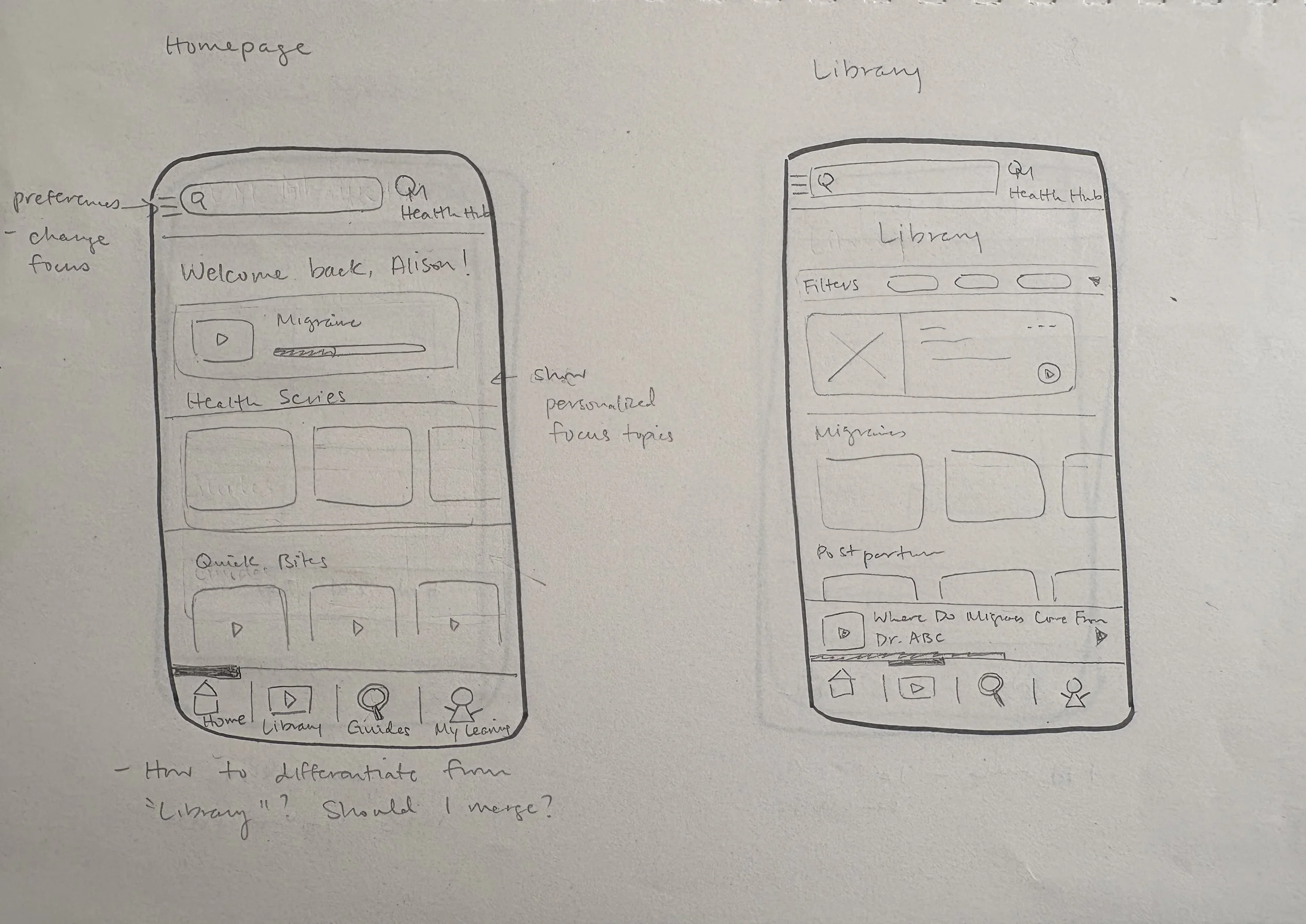
Wireframe Sketching
I drew inspiration from Spotify and Calm for the layout and design of elements. The frequency and purpose of usage for their users reflected the feelings we were seeking to provoke in OM Health Hub’s users — trusting, relaxing, and enjoyable.
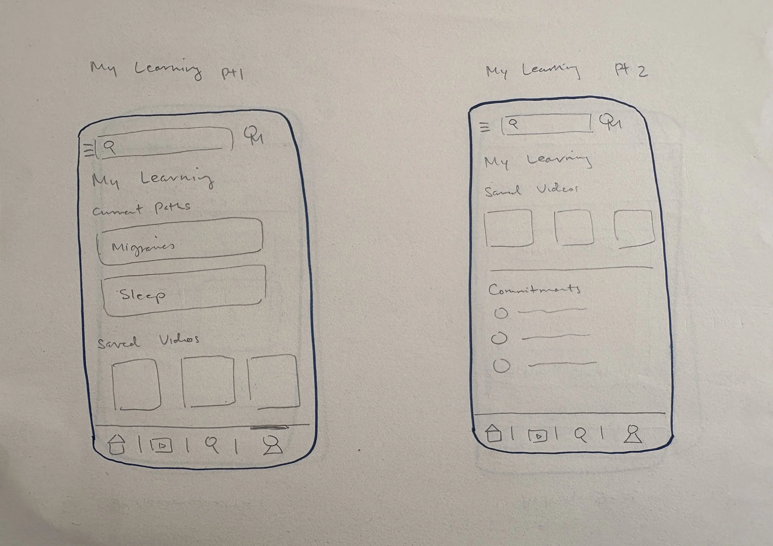
Mid-fi Prototype
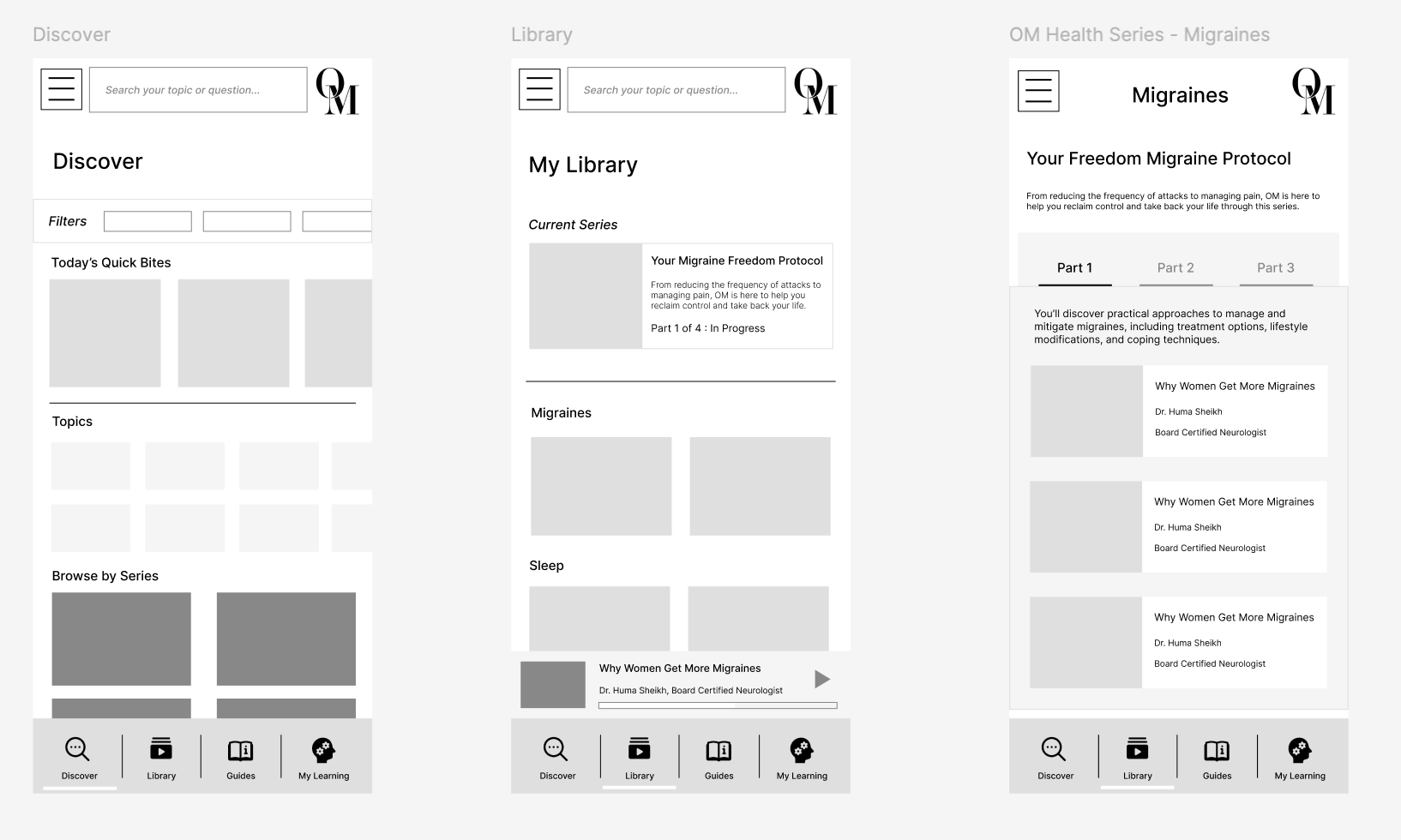
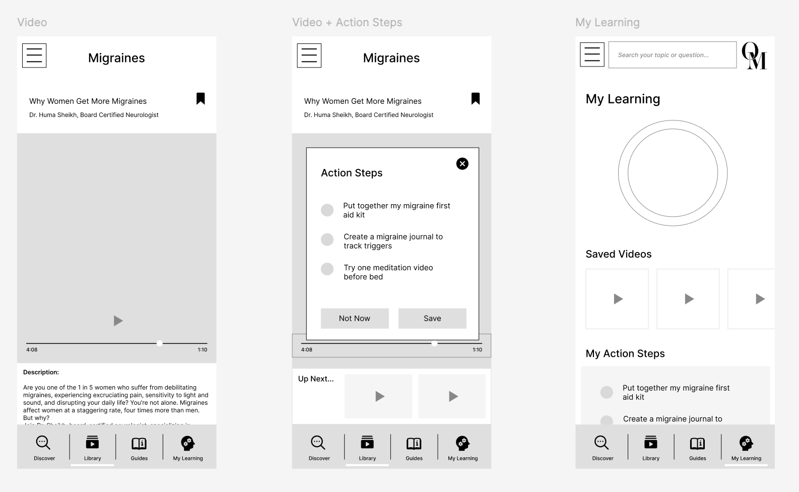
This version was focused on creating the few main screens needed for the chosen task flow, and samples of the Discover and My Learning sections.
The focus was to determine the user flow, general layout of elements, and features that would support the UX.
The feedback for this version: the purpose of pages was clear and smooth, and they’d be looking for suggested content and personable features. They wanted both options of series and individual videos, be able to reference videos easily at a later time, and some qualitative self-assessment to improve body attunment.
Branding
OM Health Hub’s founder did not need a new logo, so the one I’ve made is for portfolio purposes only. She also shared some UI color inspiration from the LUSH app for reference and asked me to follow this direction.
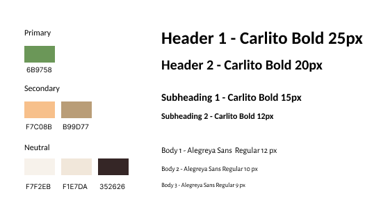
Colors
To pair with the neutral colors, I chose a light green and orange to highlight the vitality, growth, energy, harmony, and calm I hope users feel from using the app.
Typography
Based on the current fonts OM uses, I chose Carlito Bold for headings and Alegreya Sans for the body to maintain the consistent, professional, yet friendly aesthetic.
Users want to trust and rely on the information from OM Health Hub, but need a fine balance of editorial and relatability.
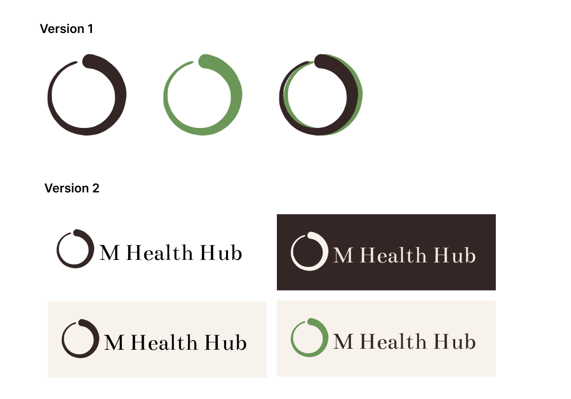
Logo
OM Health Hub wants to emphasize the narrative that we need to view health holistically, every person’s health journey is uniquely different, and they want people to be well-informed and more empowered in their own bodies.
And so, I found a circular brush stroke or ensō to signify balance, the beauty of imperfection, where we allow ourselves space for continued growth and movement, with the fluid motion of the stroke capturing the life energy, or Chi.
Final Product
Iterations from Mid-fi Version:
Feedback provided for successful user actions
Scaffolded learning through learning pathways and suggested content
Flexibility in choice of and access to content
Filters to manage visual and cognitive overwhelm
Addition of Action Steps to encourage application of new knowledge
Easy reference and visual cues to the current position of learning and progress
Earth tones to reflect balance and being grounded
Error prevention by graying out invalid options
Additional Design Choices
Start with wide selection of content and gradually personalize more as user moves through app
Qualitative self-assessment for user to grow self-awareness and advocacy
Structure user’s control differently based on purpose of feature
Testing & Feedback
I tested the flow and interviewed 5 potential users for their feedback on the features and design.
All interviewees completed the task with minimal support, and provided the following qualitative feedback:
What’s Working
Informative, personalized, resourceful, organized, curated, calm, simple, and actionable.
Action Steps, Topic filters, OM Expert live stories, and “What We’re Loving” by OM Experts
Segregation of what you want to see and what is available
The scaffolding of personalization through the journey
Users being given more control over what content they see
What Needs Improvement
Clarity on visuals for playlists and individual videos
Include symptoms as filters and suggested feature
Tips for users to use as they go through their own health checks and research
Reflections
-
I was personally very motivated to work on this project because I identified with the problem OM Health Hub was trying to solve and believe in the importance of health literacy and advocacy.
This project allowed me to tap into my cognitive science and education training where I had to tackle the age-old question of “How do you scaffold learning effectively while maintaining engagement?”
I learned that one product will not be able to solve a systematic issue; however, if it can soothe a friction point and shift users’ attitudes about the problem, then you’ve done enough.
-
OM Health Hub’s founder wanted to go a different direction midway through of having more quick bites of engagement, while I was focused on building a learning path to scaffold users’ learning. I had to figure out how to balance designing for needs of users from my research (and what I personally believed was more important), but also satisfy the business goals and the “trendy”, dopamine rush user behavior.
My solution was to have the app have an information funnel approach, where personalization was segregated and users had the freedom to move between levels at any time.
-
Polling cards and infographics in “Discover” for community engagement
Include option for trailers of individual videos and playlists
Written guides by experts for variety in learning content format
Community function of being able to share videos or post personal anecdotes about experiences with health issue
Follow through for Action Steps - assisting user to complete them