Riley
Empowering parents with a smart checklist feature that does the remembering for them, tackling the everyday chaos one check at a time
Client: Designlab UX Academy Capstone Project
Tools: Figma
Duration: July - August 2025 (75 hours)
Skills: UX/UI & User Testing & Interactive Design
About
Riley is an AI-powered mobile app that provides 24/7 expert backed support, smart tracking, and advice personalized to each individual parent and child. Its unique main features currently include its chat bot called “Riley”, a “Golden Window” sleep predictor, voice mode to record notes and speak to Riley, and “Riley Together” that allows up to 3 caregivers access to the data and collaborate.
The Problem
Working parents have a multitude of responsibilities that leave them feeling overwhelmed and exhausted, taking away attention and presence they want to give their child.
Based on my interview research, I’ve found that:
The cognitive and emotional needs of caregiving are causing parents to feel very overwhelmed and stressed, which then inhibits their capacity to be emotionally present and connect with their child.
The overwhelm requires multiple sources of support and resources to adequately address. At the moment, most apps address the knowledge and community of parenting, and not as much about the logistics.
The Question
How might we alleviate the stress of caregiving responsibilities and give parents more mental space to be present with their child?
The Design
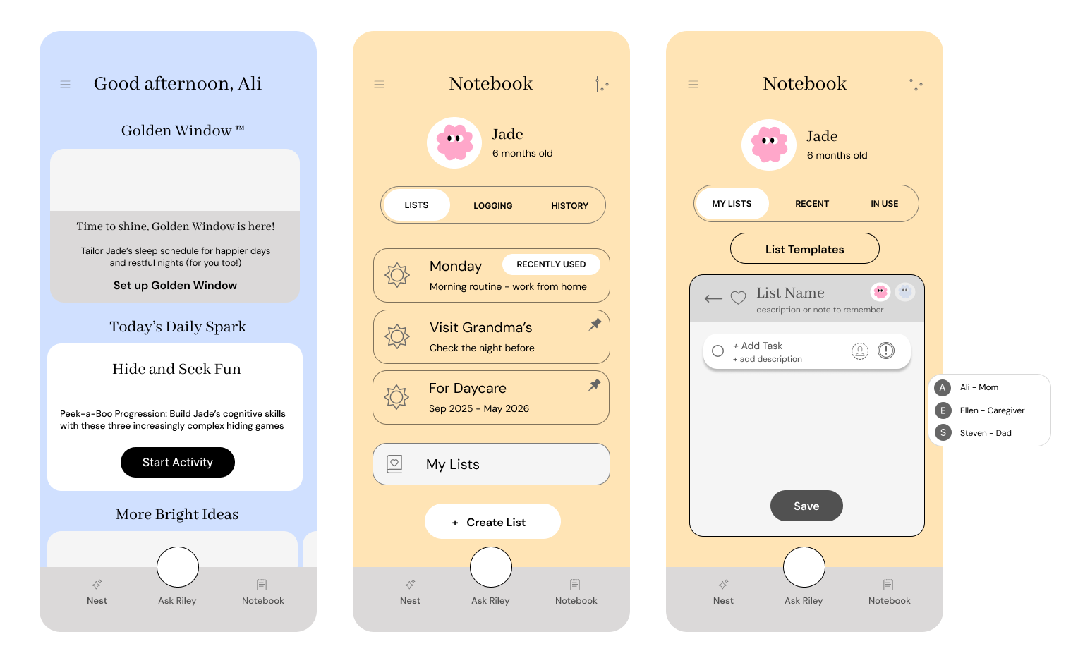
Create a new checklist - with a template
Create a new checklist - without a template
This checklist feature is designed to ease the time and mental effort required to plan, remember, organize, and execute the many items of running a household, so that they can enjoy more present moments with their children.
Features
Suggested templates for convenience and options to add onto them
Mark items as priorities and assign tasks to one another to avoid repetition or miscommunication
Save lists for future use, with up to 5 pinned lists for quick access
Preliminary Research
Competitive Analysis
I conducted a competitive analysis to compare current features on other parenting apps and platforms that also offer personalized expert parenting support via an AI model or real life.
These included: Cooper Parenting, Good Inside, Pardeo, and Aria
Strengths
Provide live workshops and coaching, moderated chat support
Provide child tracking, milestone monitoring and activity suggestions
Short form and long form content available
In-app features of saved posts, cultural affiliations for parent groups
Weaknesses
Features do not focus on decreasing the cognitive load on parents of daily caregiving, but more focused on adding onto their knowledge of parenting
A gap of what and how to apply the information in their own context
Amount of information to go through can feel overwhelming
Key Research Insights
After interviewing 5 parents with children under 3, the themes that emerged were:
Parenting Priorities
Physical health of child
Having positive values and high EQ
For them to enjoy learning and develop strong thinking skills
To have respect + empathy for others
“For me, success is, yeah, my son is healthy. And, you know, he enjoys learning, he enjoys life, like I would say, I did a really good job.”
Challenges of Daily Caregiving
How to maintain personal identity
Uncertainty about child's condition and development
Balancing personal needs with parenting responsibilities
Needing organization like a chart that combines feeding, exercise, and other activities
Contradictory beliefs in caregiving
“You're just fully consumed by your child. So it's really hard to get out of the house on time. You're just scrambling all the time. So it's really hard to, I mean, staying organized is what's keeping me alive right now.”
Support and Resources
Mainly from family and friends (individual + community)
Gaps in addressing uncertainty and overwhelming situations
Want more guidance from professionals
Values real-time, personalized advice over general online information
Lack of knowledge and guidance on parenting
Values AI's ability to condense multiple information sources
“There are seminars out there, but we don’t have time to go to these seminars, but there are so many conflicting information on google”
User Persona: The Do-it-all Parent
Want personalized, reliable, and accessible support that can provide research-based and real-life guidance on how to navigate various parenting situations.
Have tools that make them feel calm, organized, and competent to tackle the mounting responsibilities
Be present and connect with their child
Value features that are intuitive, ease cognitive load, and embedded in their existing routine
Limit the number of parenting apps they need to use and rely on
Learn about their unique child and provide care that is most suitable for them
Be in community with other parents that are going through similar stage of parenting
Conceptualization
At the moment, Riley only has a space to log caregiving information, but not a feature that assists parents in remembering and completing organizational caregiving tasks.
While ideas like adding a community board, creating pod support groups, guided exercises for emotional regulation, and short video posts from professionals were considered, focusing on addressing the logistical part of caregiving was more essential.
And so, I decided to add a checklist feature that can release some mental load when managing their caregiving responsibilities, which would hopefully give parents more space to engage in more meaningful activities.
Feature Needs
Work with the current flow and support Riley’s current features and design
• For everyday usage
• Multiple user access, tracking feedings/changes/sleep, AI-chat bot
• Visual layout and element placements need to match and seamlessly fit
Support organization and limit the of user
• For the visuals and buttons to look and function like the other features
• Make elements as familiar as possible to another app for checklists (like Notes)
• Templates for quick access and immediate use - shorten the pause and effort required to think and create
Include advantageous functions that other organizational tools do not include
• Assigning tasks to different users
• Mark certain tasks as priority
• Subcategorize items with descriptions and notes for details
User Flow
I mapped out the 2 user flows that the feature prototype would be able to showcase:
Selecting and using a saved list
Creating a new list (with and without a template)
Flow Requirements:
3 options of list making — Create Their Own, Templates, and Saved Lists
Functions more useful and effective than the Notes app
Only requires up to 5 screens to complete a task
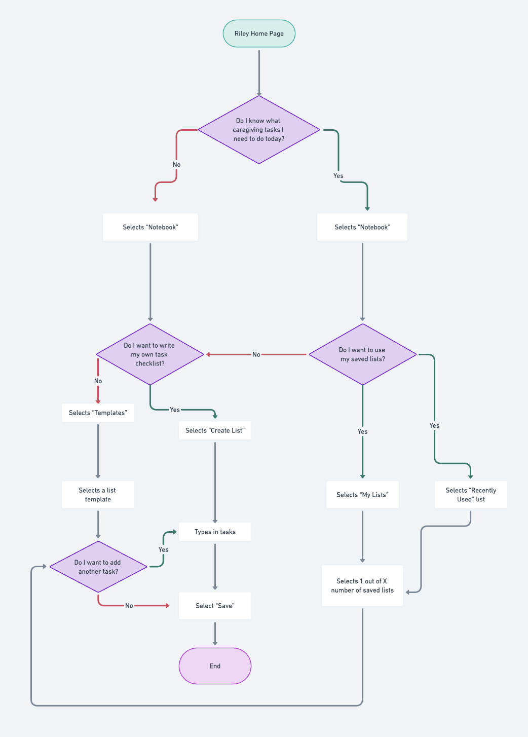
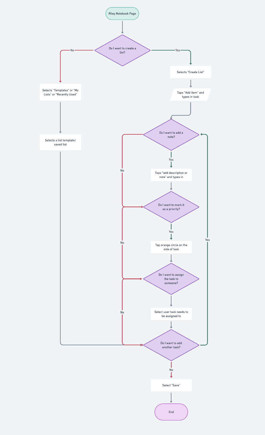
Templates: Eg: weekday, weekend, activity day
Create List: Includes list titles, note description, priority level, assigned user
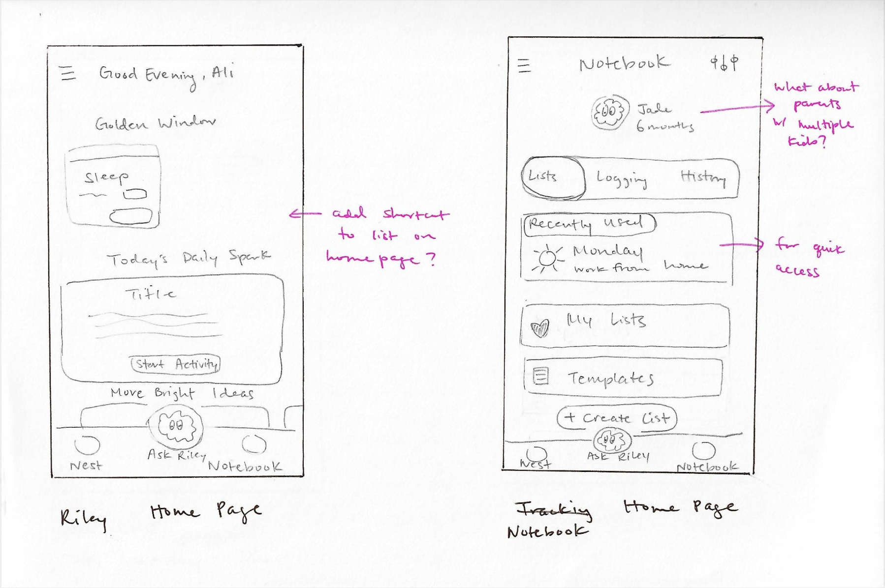
Riley Home Page: Existing -> starting page of navigation for tasks
Notebook Main Page: Saved lists, templates, create new lists, recently used
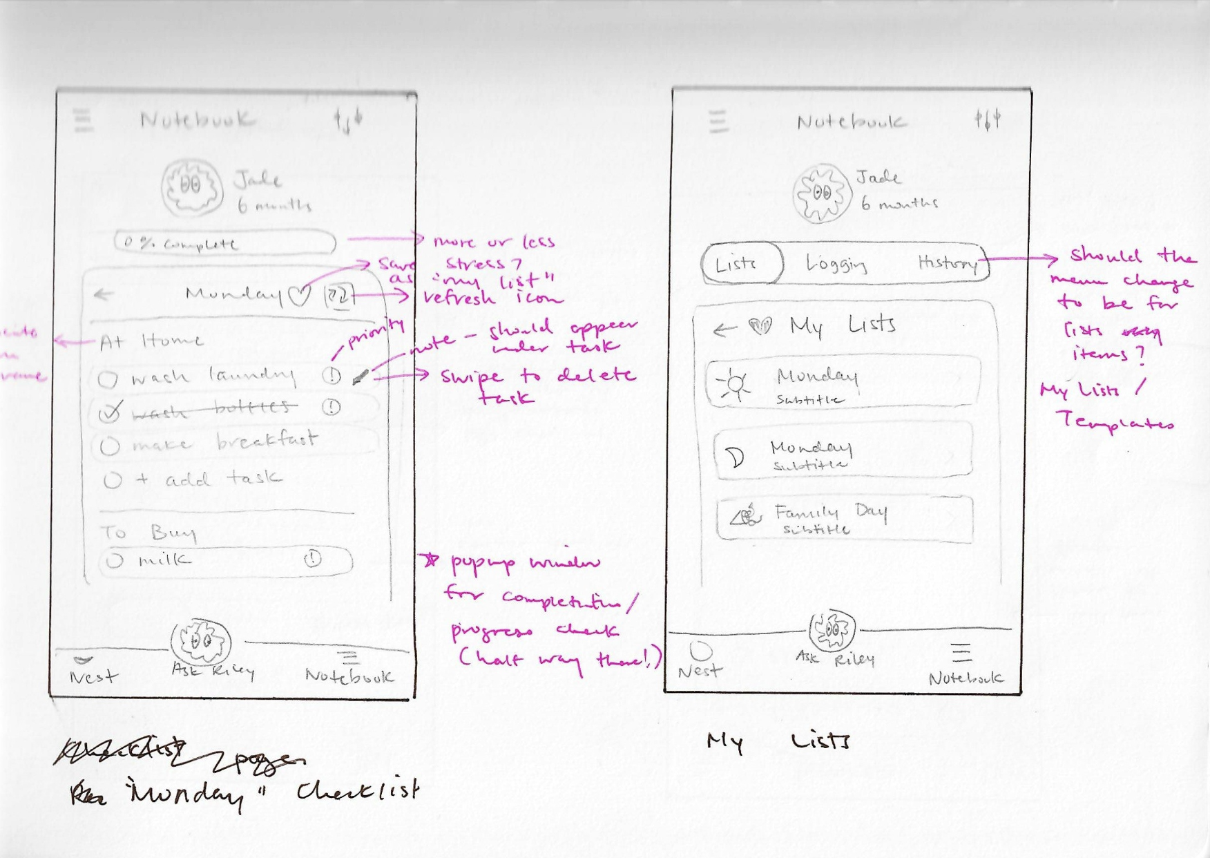
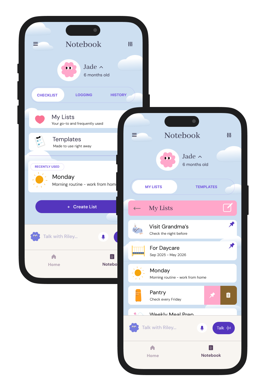
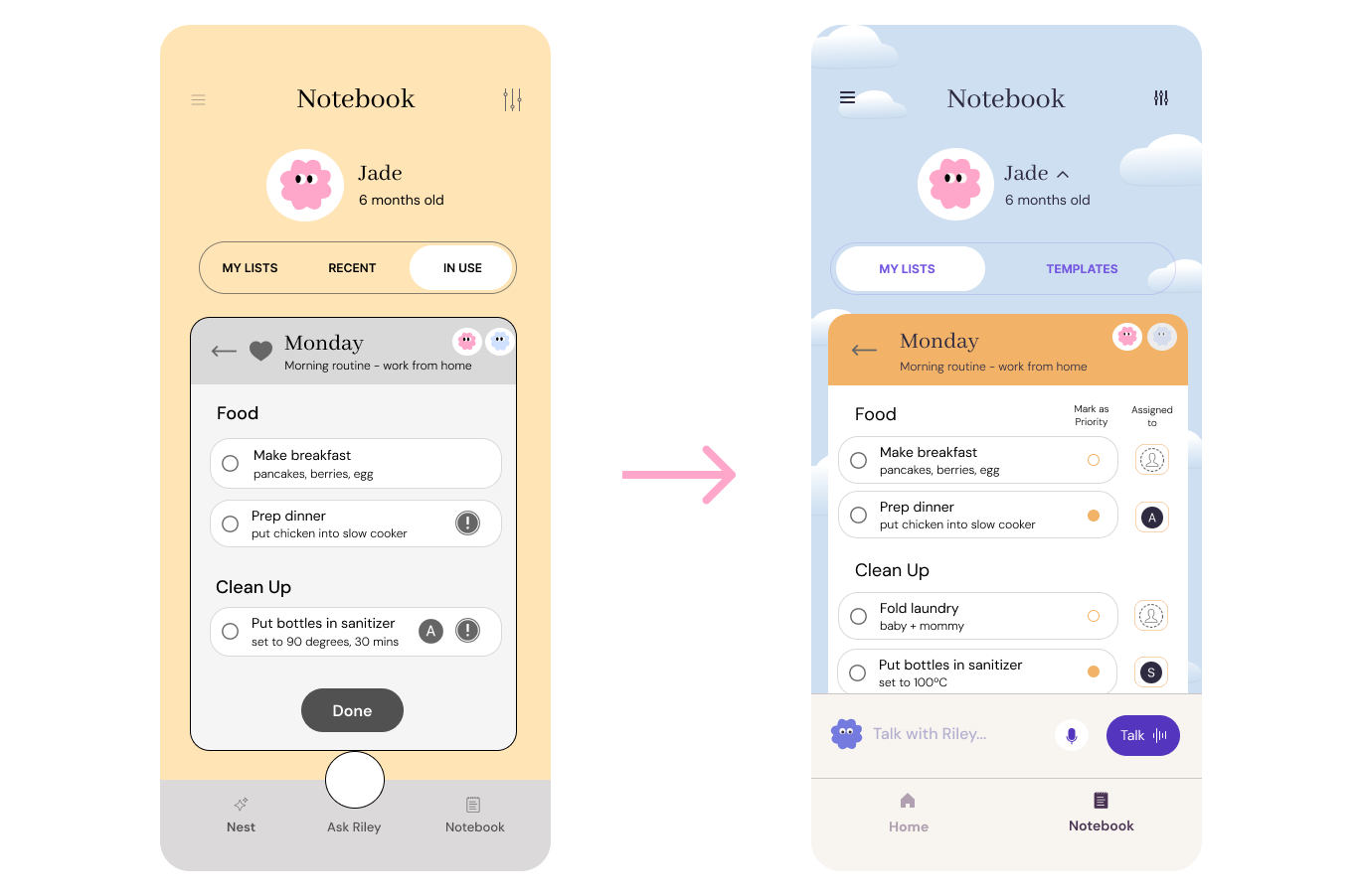
“Monday” Example of a Saved List: Saved button, easily reusable
My Lists: Collection of saved lists (both created and edited templates)
Mid-fi Prototype
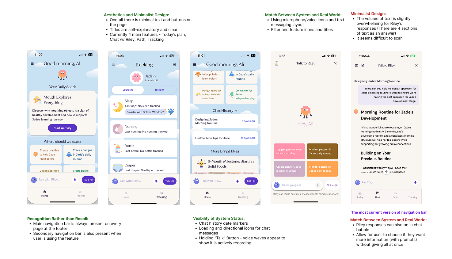
I created wireframes to test out the 3 different task flows and used the version of Riley available at the time as a reference for visuals.
Design Functions:
Order of screens in layout and user process → What will make most sense to users?
Need for “recent” and “in use” function → Would it ease or disrupt flow?
Icons of priority and assigned users → What resonates with users?
Placement of buttons → Did they assist in the user flow?
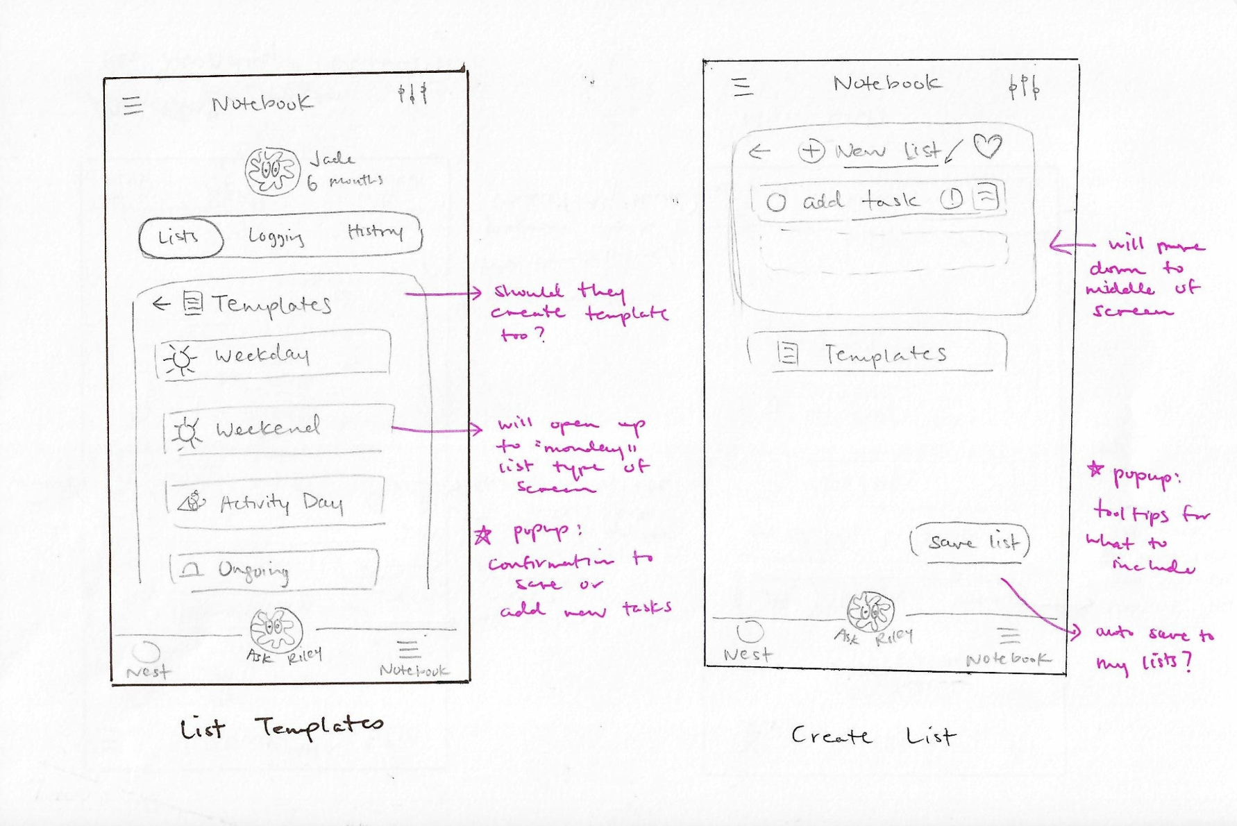
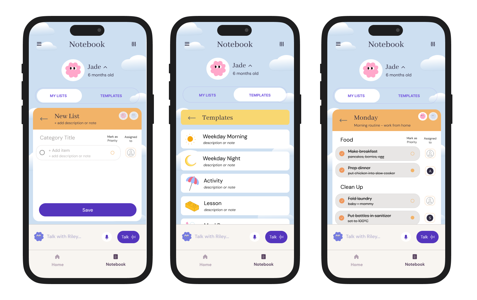
Preview of “Creating a New List - Without a Template”
The checklist feature was embedded into the original “Tracking” feature, which I renamed “Notebook”.
Parents need multiple ways to access the list they need, so I wanted to test which pathway would be most useful and necessary.
I placed the templates option within “Create List”, and wanted to test this placement choice during user testing.
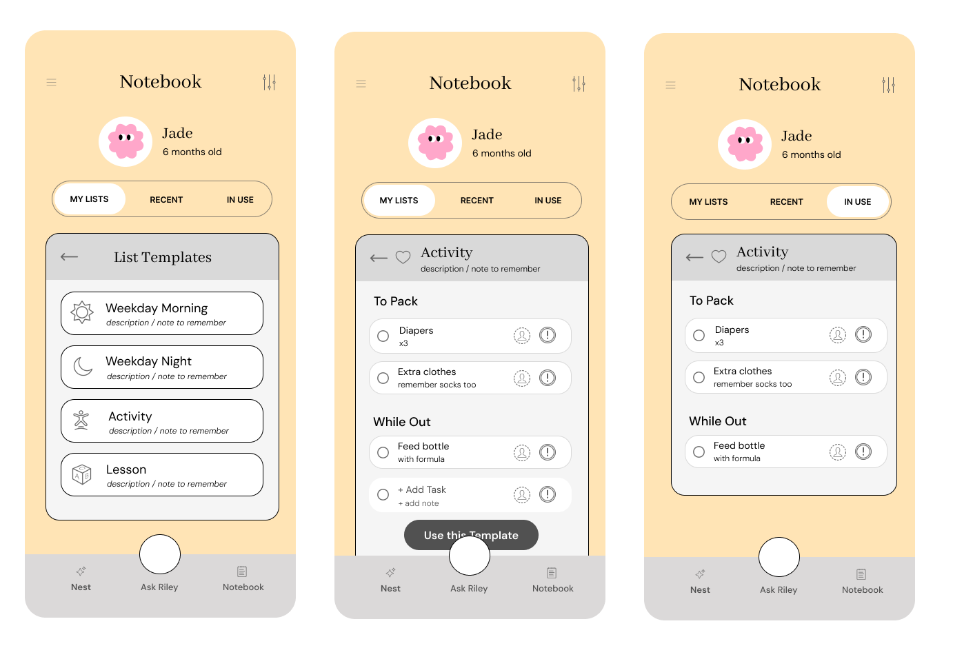
Preview of “Creating a New List - With a Template”
Once a user selects a template, they will get the option to preview it before using it, and also see that they can add to the template whatever they want.
When the template is selected, the user will see it under “In Use” to show that it is an active list, mark items as priority, and assign it to different account users.
I placed “Recent” and “In Use” as menu tabs because I thought users may want a shortcut to quickly access previous lists or the current one, but I would have to test this hypothesis during the usability test.
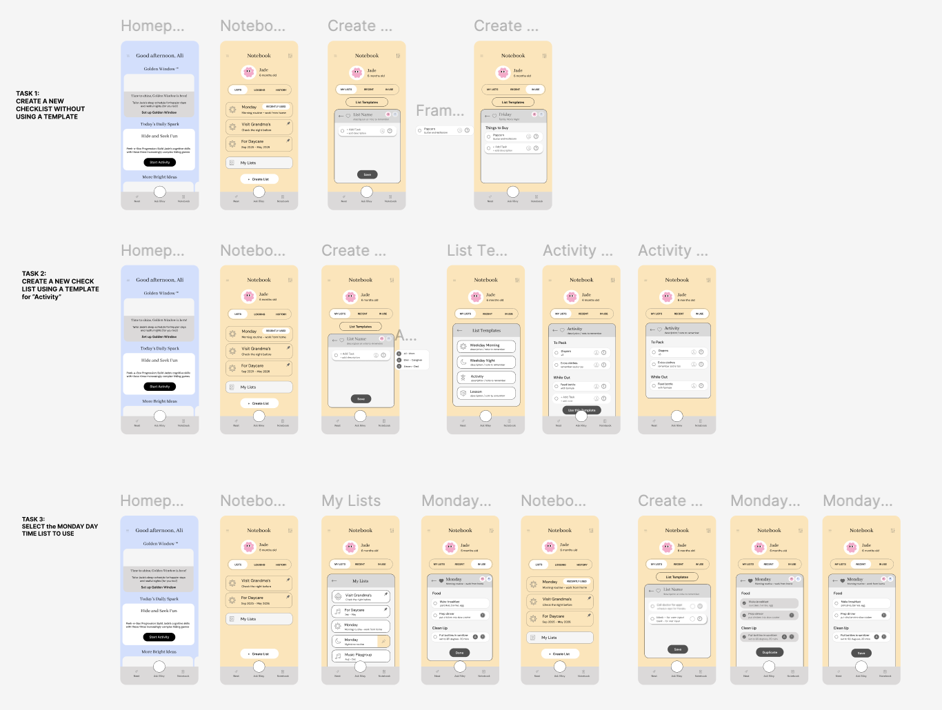
Usability Testing
I interviewed 5 parents with young children, 2 of whom also did the research interview. It was done via Zoom and in person.
My purpose was to test usability flows and identify user’s preferences of UI elements.
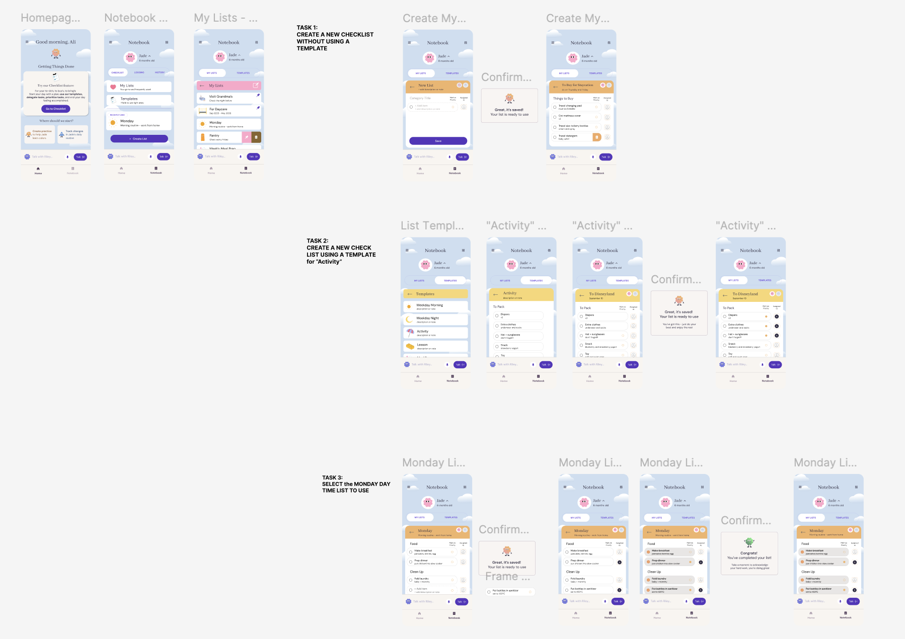
They were asked to:
Create a new checklist
Create a new checklist using a template
Select a saved list and use it
The follow up questions were about their likes and dislikes about UI elements and features, clarifications and prediction of personal usage.
Task Success Rate: 100%
Avg. Likeliness to Use Feature: 6.4/10
The users tested were not Riley users, which could account for the lower than desirable rating. It would be interesting to test on current Riley users to see whether this feature would add to their current experience.
Positive Findings
Positivity and openness towards the feature and could instantly relate to its level of effectiveness and how to improve it to suit their usage more.
Loved the color choice and layout of elements
Appreciated how there were elements from other apps used here as well, such as pins, marking as important, and collaborative users
Areas for Improvement
General confusion around the meaning of titles and the usage differences between them
Some shared they would have use for a “most recent” category, while others thought that made it more confusing about where to find certain lists
Many users suggested to integrate more of the AI functions into the list feature as well, like being recommended lists to use based on your information of habits and developmental stage of child, to creating lists for you on demand.
Final Product
After testing, I evaluated the various comments against the time constraints and scope of project, to decide which iterations to make for the final MVP.
During the time of editing, the Riley’s UI was updated, so the final prototype reflects its updates.
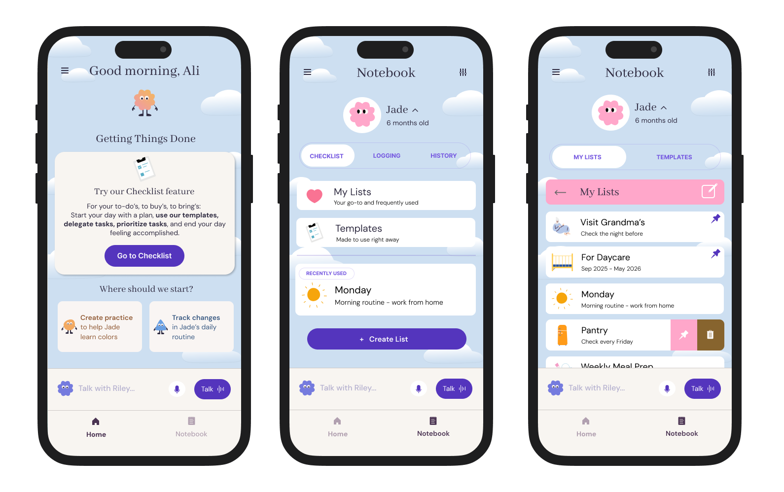
Edit #1: Categorization and Placement of Pages
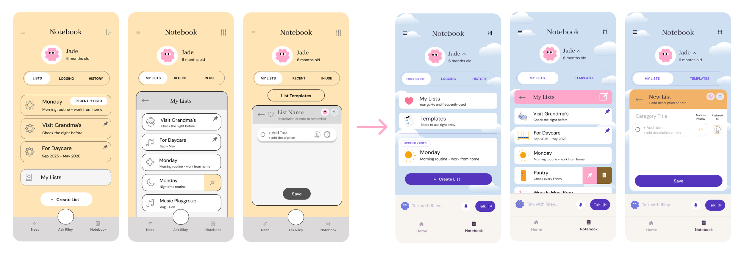
Users told me how confusing it was to have so many options available to them. Turns out having more options leads to more friction!
Now users can access the templates at the “Notebook” home page.
I rearranged the order of options and placed pinned lists inside “My Lists” to keep them in the same category and distinguish them from “Recently Used”.
Lastly, I removed the “Recent” and “In Use” tabs at the menu bar, and changed it to “My Lists” and “Templates” instead.
WHY: It seemed more likely that user may switch their mind mid-way through making a new list and need quick access to a template. Additionally, they would not need to click into a new folder to access a list in use.
Edit #2: New Icons
The Priority and Assigned User icon types and placements were changed to become a colored dot, placed in a separate component from the assigned user.
WHY: Some users mentioned the ! icon led to a stress response and indicates there is a problem, rather than a more neutral one. The placements had to be switched and adjusted for accessibility reasons.
Edit #3: Completion Messages and Subtitles
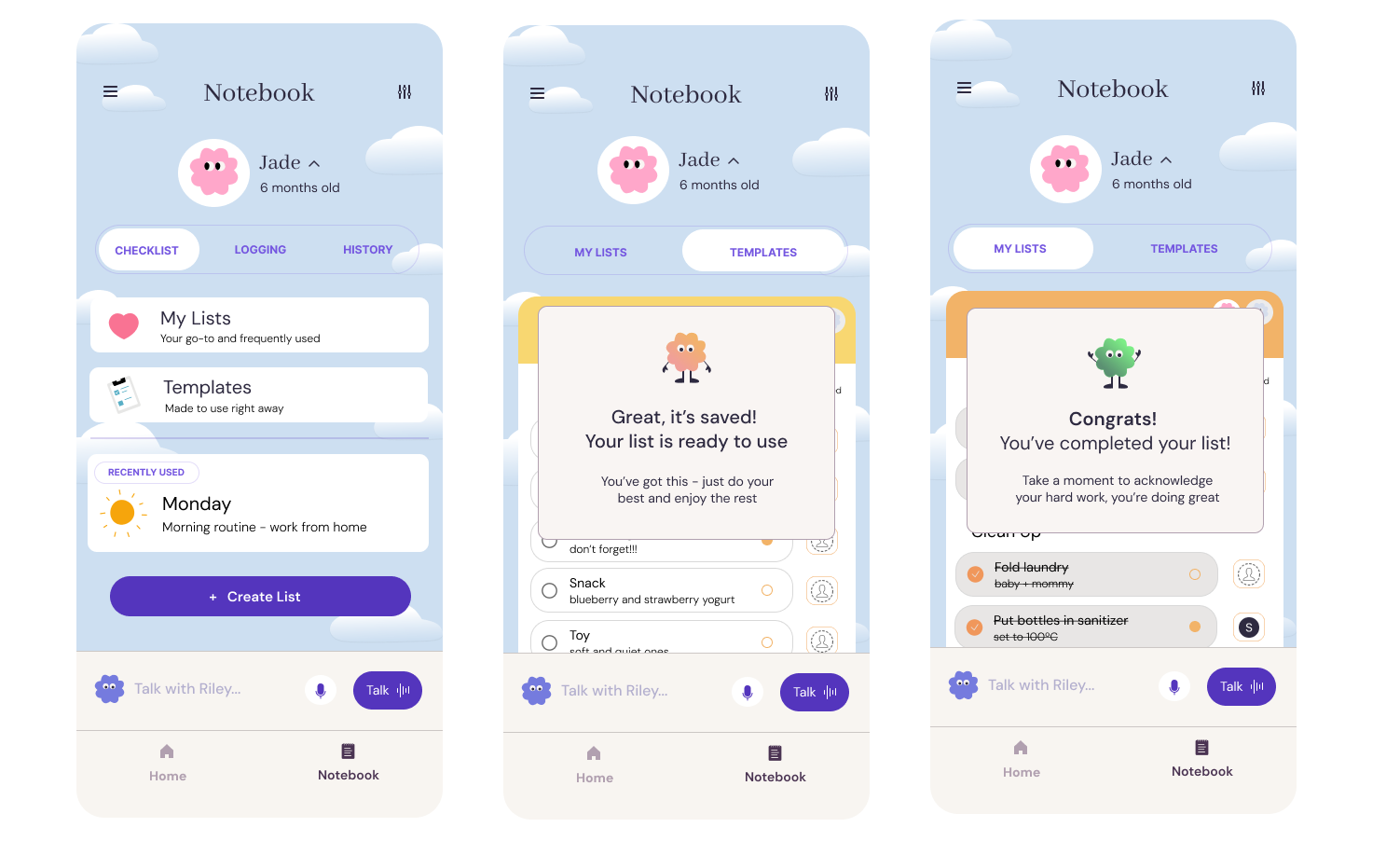
I utilized the subtitle space to explain the purpose of the different pages, and added confirmation messages at the mid and endpoints of the user flow.
WHY: In response to users’ confusion during testing, the purpose of the pages and the state of the pages required more clarity. It also presented a suitable place to encourage the user and build brand messaging.
Reflections
Project Takeaways
-
Creating something that targets the problem of parents’ overwhelm and adding onto a current app provided the constraints that were very helpful to guide my creative and design process
-
The needs of parents differs heavily based on the age of the child
Many parents desire the same outcome of their child and parenting experience
They want the easiest and simplest resources to use - must have close to 0 friction
They are trying to strike a balance between having too much and too little information
They are open to help, but hesitant to try things - fear of difficulty, irrelevance, ineffectiveness
-
All the parents i interviewed felt emotionally supported at a higher level than I expected, which led me to think the overwhelm is not solely due to emotional support but many other factors.
That led me to look at other aspects that can lead to overwhelm - such as disorganization, lack of knowledge, indecisiveness, too much choice, too much information, contradicting approaches to parenting to decide on the new feature.
-
The tools need to make them feel calm, organized, and competent to tackle the mounting responsibilities
simple UI (using elements from Notes app for familiarity)
minimize the number of folders and screens to go to complete a task
assigned tasks to support and encourage collaboration
marking items for priority - can distinguish what is urgent vs. important
Value features that are intuitive, ease cognitive load, and embedded in their existing routine
everyone has used checklists before
templates - building off of their current data and suggesting the appropriate ones to them, quick use and eases the decision making paralysis
subtitles within list add clarity, allow for quick scanning
Limit the number of parenting apps they need to use and rely on
not a new section to get to know, built within a current section
Challenges
-
Which functions were the most important? What would a majority of users want? What would most users most likely do? How many lists would they really make to require this function?
-
During the iteration phase, I disagreed with some suggestions that user testers gave me (eg: whether or not “recently used” was needed). Most of the feedback I listened to, while small details like the example mentioned I kept. I think if I went through another round of testing with Riley users, I would listen to that feedback fully.
-
How many potential use cases and what ifs do I design for? For example, the use case of multiple lists being used at once or wanting to adjust task order as the day goes.
What I Learned
Start small and pick the most essential then add on, rather than the other way around - decreases the decision making paralysis in the iteration stage
Don’t over complicate!!!
Imagine myself as my user persona going through the user flow and ask myself → Where would I click? Do I need this option? Where would I be confused?
It’s a fine balance between using what people are used to (patterns) and introducing a new and “better” way of doing something
Next Steps
An onboarding quiz to know their habits so app can suggest appropriate lists, and continue to learn their routine based on the lists used at specific times (like how Uber predicts and suggests the destination you need to go to based on time)
Smart function where app can anticipate what list you need for the week, populate your lists based on your Riley chats and be aligned with developmental stage.
It could also extend to creating title subheadings for you, anything to eliminate the pause and alleviate stress for parents.